Principal component analysis for multi-spectral data 
Sign up to the DEA Sandbox to run this notebook interactively from a browser
Compatibility: Notebook currently compatible with both the
NCIandDEA SandboxenvironmentsProducts used: ga_s2am_ard_3, ga_s2bm_ard_3
Background
Principal Component Analysis (PCA) is a popular technique for dimensionality reduction. It can be used to explore patterns in high-dimensional data and assist unsupervised learning.
Principal components are a series of linear combinations of the original variables, among which the first principal component accounts for the greatest variance within a dataset. Each subsequent principal component accounts for the next greatest possible variance and is uncorrelated with the previously defined components.
This technique is useful for understanding Sentinel-2 data as images are captured in 12 spectral bands but only 3 variables can be visualized in a RGB composite. PCA can also be applied to timeseries data to investigate temporal evolution patterns for different land cover types.
Description
This notebook demonstrates a principal component analysis for Sentinel-2 multi-spectal data. Following steps are covered:
Loading Sentinel-2 multi-spectral data.
Applying PCA to transform and visualize data.
Getting started
To run this analysis, run all the cells in the notebook, starting with the “Load packages” cell.
Load packages
Import Python packages that are used for the analysis.
[1]:
%matplotlib inline

import datacube
from sklearn.decomposition import PCA

import sys
sys.path.insert(1, '../Tools/')
from dea_tools.datahandling import load_ard
from dea_tools.plotting import rgb
from dea_tools.classification import sklearn_flatten, sklearn_unflatten
Connect to the datacube
Connect to the datacube so we can access DEA data.
[2]:
dc = datacube.Datacube(app='Principal_component_analysis')
Analysis parameters
This section defines the analysis parameters, including
lat, lon: center lat/lon for the area of interestbuffer: the window size around the centre lat/lon for the area of interesttime_range: time period to be investigatedmin_gooddata: minimum fraction of good-data in the image before it while be returnedbands: spectral bands to be explored
The default location is the Norman River, Qld.
To limit overall memory usage, if a larger analysis window or higher resolution is desired, the time period should be reduced accordingly.
[3]:
lat, lon = -17.5687, 140.9653
buffer = 0.05
time_range = ('2019-12', '2020-03')
bands = [
    'nbart_blue', 'nbart_green', 'nbart_red', 'nbart_red_edge_1', 'nbart_red_edge_2',
    'nbart_red_edge_3', 'nbart_nir_2', 'nbart_swir_2', 'nbart_swir_3'
]
min_gooddata = 0.99
Loading cloud-masked Sentinel-2 multi-spectral data
[4]:
# Define the query dict
query = {
    'time': time_range,
    'x': (lon - buffer, lon + buffer),
    'y': (lat + buffer, lat - buffer),
    'output_crs': 'epsg:3577',
    'resolution': (-20, 20),
    'group_by': 'solar_day',
    'measurements': bands
}
[5]:
# Load the data
ds = load_ard(dc=dc,
              products=['ga_s2am_ard_3', 'ga_s2bm_ard_3'],
              min_gooddata=min_gooddata,
              mask_pixel_quality=False,
              **query)
Finding datasets
    ga_s2am_ard_3
    ga_s2bm_ard_3
Counting good quality pixels for each time step using fmask
Filtering to 6 out of 24 time steps with at least 99.0% good quality pixels
Loading 6 time steps
[6]:
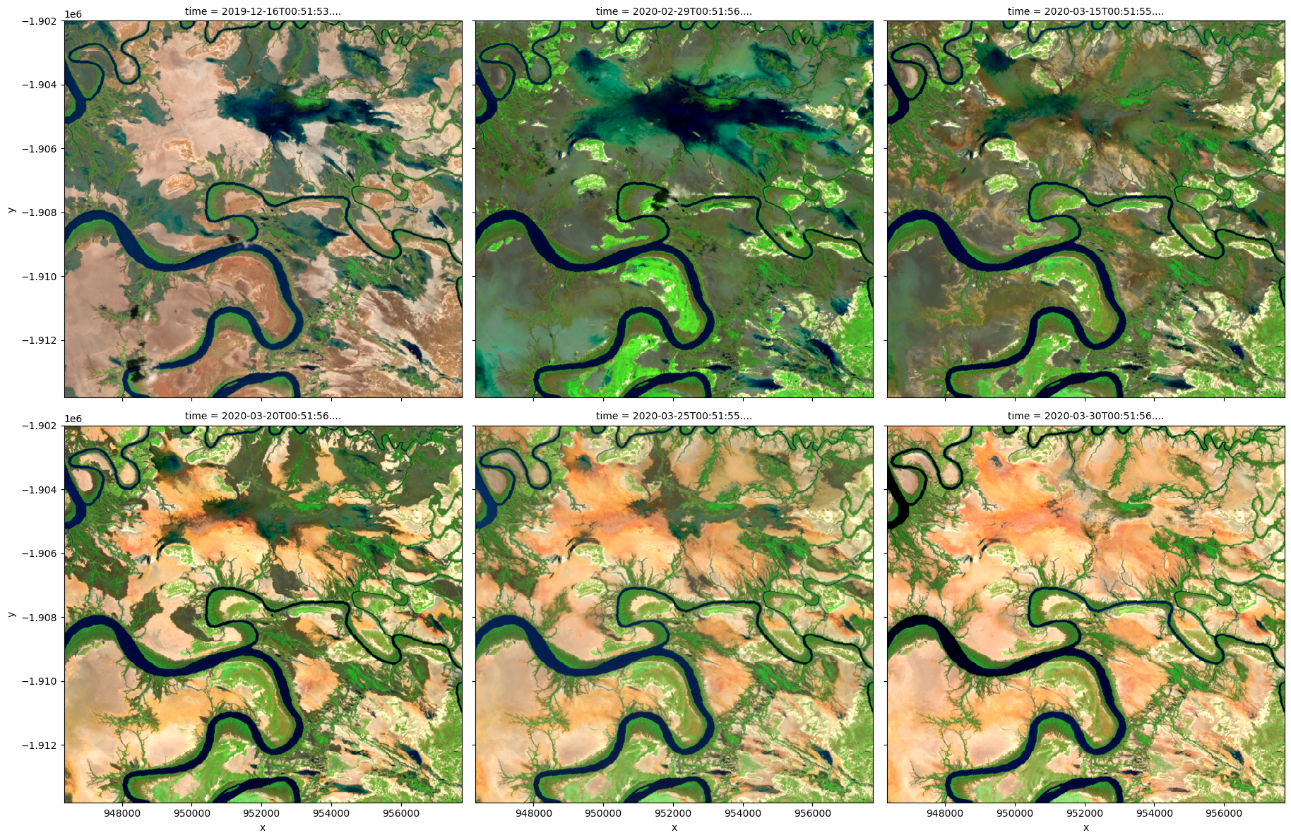
# Visualize data using selected input spectral bands
rgb(ds,
    bands=['nbart_swir_2', 'nbart_nir_2', 'nbart_red_edge_1'],
    col='time',
    col_wrap=3)
Applying PCA to transform and visualize data
To perform a PCA, data is first transformed into a numpy array that can be used by sklearn using the DEA function sklearn_flatten.
[7]:
x = sklearn_flatten(ds)
A PCA model is generated with 3 principal components and fitted on the data.
[8]:
pca = PCA(n_components=3)
pca.fit(x)
[8]:
PCA(n_components=3)In a Jupyter environment, please rerun this cell to show the HTML representation or trust the notebook.
On GitHub, the HTML representation is unable to render, please try loading this page with nbviewer.org.
PCA(n_components=3)
We can investigate how much variance is accounted for in each principal component. In the default example, the first principal component accounts for a much high variance than the next two.
This step can help determine whether more principal components are needed.
[9]:
print('Relative variance in principal components:',
      pca.explained_variance_ratio_)
Relative variance in principal components: [0.86241157 0.07656634 0.05398086]
The input data can now be transformed into this new reference space and rearranged into an xarray.Dataset compatible with our input data.
[10]:
predict = pca.transform(x)
[11]:
out = sklearn_unflatten(predict, ds)
out = out.to_dataset(dim=out.dims[0]).transpose('time', 'y', 'x')
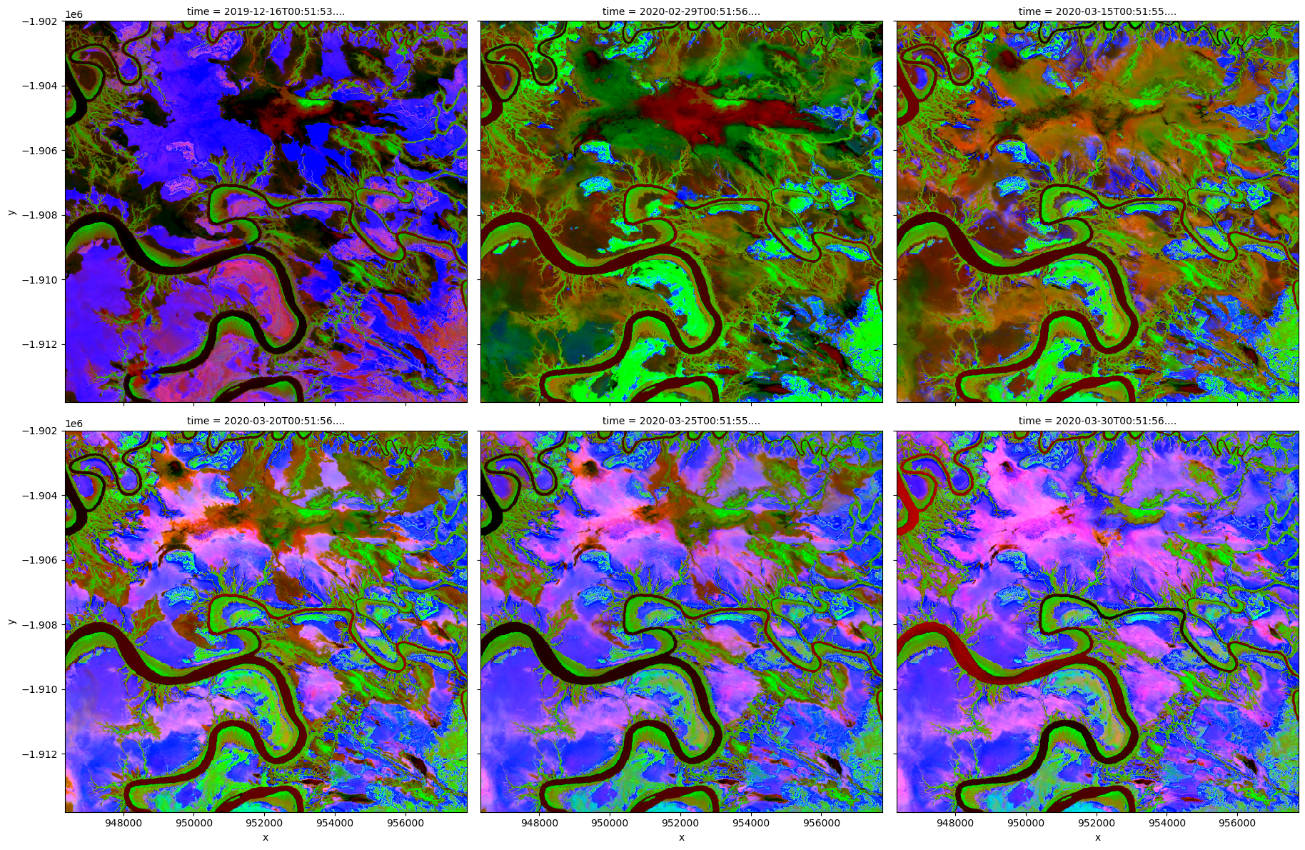
Visualise PCA results
[12]:
# Plot PCA bands
rgb(out,
    bands=[2, 1, 0],
    col='time',
    col_wrap=3,
    percentile_stretch=[0.2, 0.90])
Additional information
License: The code in this notebook is licensed under the Apache License, Version 2.0. Digital Earth Australia data is licensed under the Creative Commons by Attribution 4.0 license.
Contact: If you need assistance, please post a question on the Open Data Cube Slack channel or on the GIS Stack Exchange using the open-data-cube tag (you can view previously asked questions here). If you would like to report an issue with this notebook, you can file one on
GitHub.
Last modified: April 2023
Compatible datacube version:
[13]:
print(datacube.__version__)
1.8.12
Tags
Tags: sandbox compatible, NCI compatible, sentinel 2, rgb, sklearn_flatten, sklearn_unflatten, principal component analysis, statistics