DEA Land Cover change mapping 
Sign up to the DEA Sandbox to run this notebook interactively from a browser
Compatibility: Notebook currently compatible with the
DEA SandboxenvironmentProducts used: ga_ls_landcover_class_cyear_2
Background
Land cover is the physical surface of the Earth, including trees, shrubs, grasses, soils, exposed rocks, water bodies, plantations, crops and built structures. Land cover changes for many reasons, including seasonal weather, severe weather events such as cyclones, floods and fires, and human activities such as mining, agriculture and urbanisation. We can use change mapping techniques to quantify how these processes influence land cover.
Description
This notebook will demonstrate how to create a change map using DEA Land Cover data. Topics include:
Loading data for an area of interest.
Plotting a change map using Level 3 data.
Plotting a change map using layer descriptor data.
This notebook requires a basic understanding of the DEA Land Cover data set. If you are new to DEA Land Cover, it is recommended you look at the introductory DEA Land Cover notebook first.
Getting started
To run this analysis, run all the cells in the notebook starting with the ‘Load packages and connect to the datacube’ cell.
Load packages
Load key Python packages and supporting functions for the analysis, then connect to the datacube.
[1]:
%matplotlib inline

import datacube
import matplotlib.pyplot as plt
import numpy as np
import pandas as pd
import xarray as xr

import sys, os
sys.path.insert(1, os.path.abspath('../Tools'))
from dea_tools.plotting import rgb
from dea_tools.plotting import rgb, display_map
from matplotlib import colors as mcolours
from dea_tools.landcover import plot_land_cover, lc_colourmap, make_colorbar
Connect to the datacube
Connect to the datacube so we can access DEA data.
[2]:
dc = datacube.Datacube(app="Land_cover_change_mapping")
Select and view your study area
If running the notebook for the first time, keep the default settings below. This will demonstrate how the change mapping functionality works and provide meaningful results. The following example loads land cover data over Werribee, Victoria.
[3]:
# Define area of interest and buffer values
lat, lon = (-37.9, 144.7)

lat_buffer = 0.02
lon_buffer = 0.02

# Combine central coordinates with buffer to get area of interest
lat_range = (lat - lat_buffer, lat + lat_buffer)
lon_range = (lon - lon_buffer, lon + lon_buffer)

# Set the range of dates for the analysis
time_range = ("2010", "2020")
The following cell will display the area of interest on an interactive map. You can zoom in and out to better understand the area you’ll be analysing.
[4]:
display_map(x=lon_range, y=lat_range)
[4]:
Load and view level3 data
The following cell will load level3 data for the lat_range, lon_range and time_range we defined above.
[5]:
# Create the 'query' dictionary object, which contains the longitudes, latitudes and time defined above
query = {
    "y": lat_range,
    "x": lon_range,
    "time": time_range,
}

# Load DEA Land Cover data from the datacube
lc = dc.load(
    product="ga_ls_landcover_class_cyear_2",
    output_crs="EPSG:3577",
    measurements=["level3"],
    resolution=(-25, 25),
    **query
)
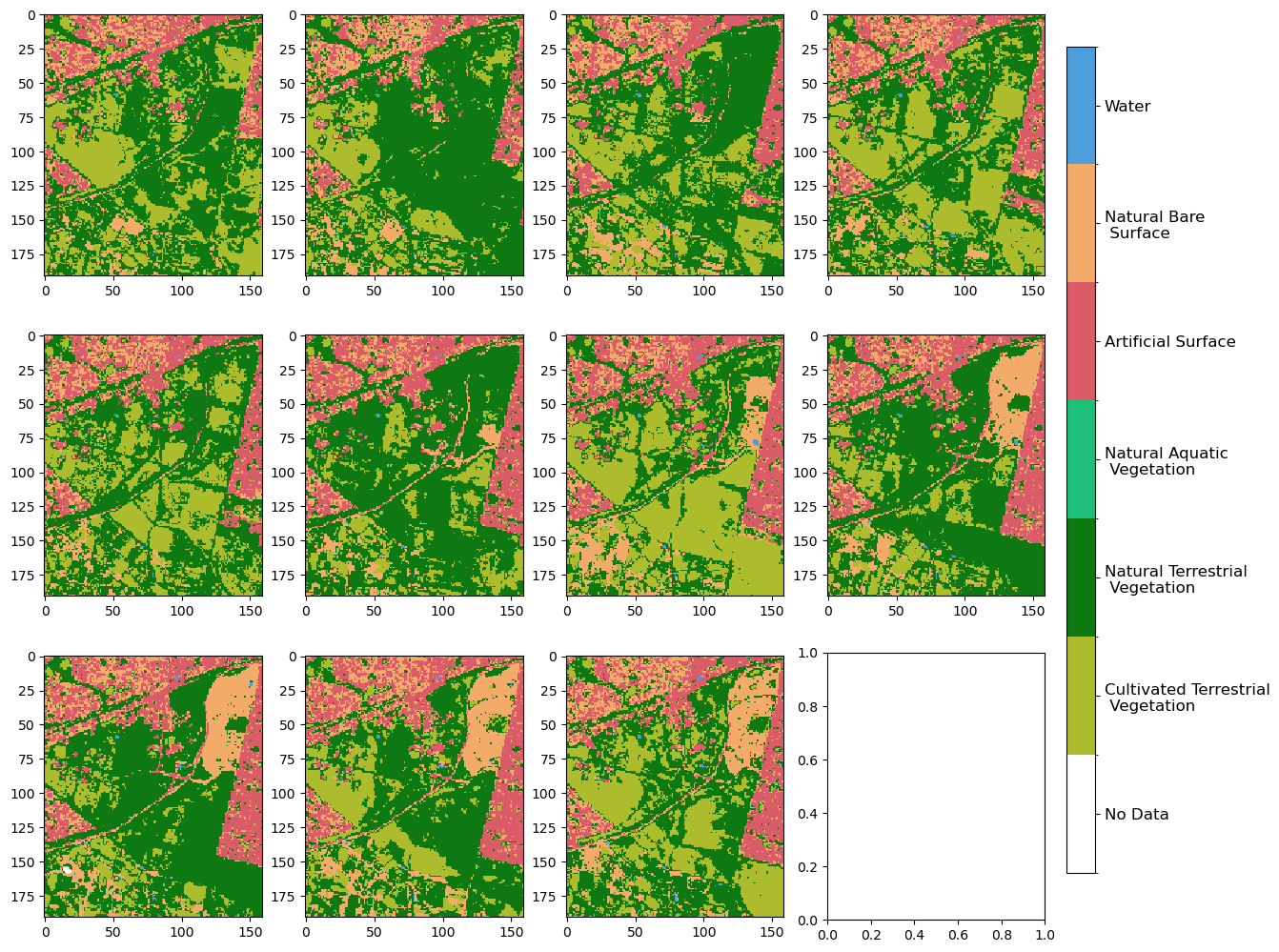
We can review the data by using the plot_land_cover() function.
[6]:
plot_land_cover(lc.level3)
[6]:
<matplotlib.image.AxesImage at 0x7f124dc00d30>
Plotting change maps
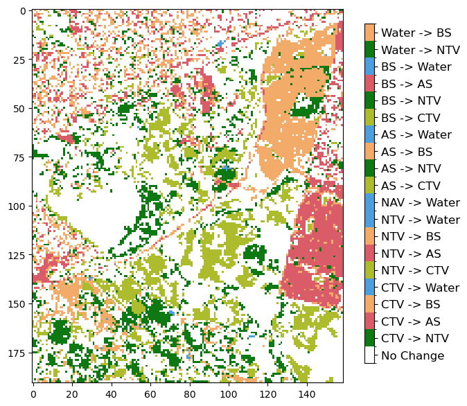
Level 3 change maps
In this section, we will create a plot that shows if a pixel changed class or remained the same between 2 discrete years. In this example, we are using 2010 and 2020.
[7]:
# Select start and end dates for comparison (change to int32 to ensure we can hold number of 6 digits)
start = lc.level3[0].astype(np.int32)
end = lc.level3[-1].astype(np.int32)

# Mark if you want to ignore no change
ignore_no_change = True
[8]:
# Combine classifications from start and end dates
change_vals = (start * 1000) + end

# Mask out values with no change by setting to 0 if this is requested
if ignore_no_change:
    change_vals = np.where(start == end, 0, change_vals)
[9]:
level_3 = lc.level3[0].drop_vars("time")
[10]:
# Create a new Xarray.DataArray
change = xr.DataArray(
    data=change_vals,
    coords=level_3.coords,
    dims=level_3.dims,
    name="change",
    attrs=level_3.attrs,
)
[11]:
# Get colour map for image
cmap, norm = lc_colourmap('level3_change_colour_scheme')
[12]:
# Create figure with subplot and set size in inches
fig, ax = plt.subplots()
fig.set_size_inches(7, 7)

make_colorbar(fig, ax, measurement='level3_change_colour_scheme')

# Plot change data
img = ax.imshow(change, cmap=cmap, norm=norm, interpolation="nearest")
Layer descriptor change maps
In this section, we will plot two change maps using natural terrestrial vegetation (NTV) data and artificial surface (AS) data. Similar to above, we will use 2010 and 2020 data.
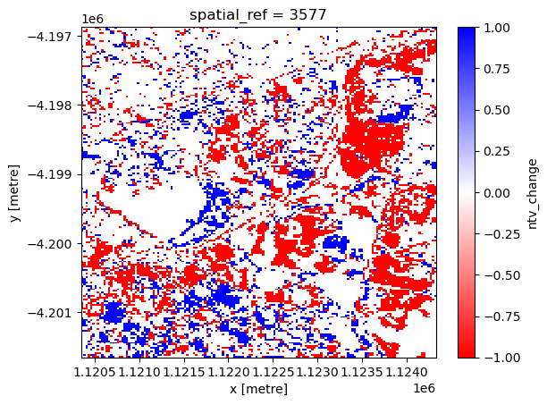
Natural terrestrial vegetation change
[13]:
# Make a mask of 1 for all increasing NTV that is anything going from another class to NTV
NTV_increase = np.where(
    (
        (change == 111112)
        | (change == 124112)
        | (change == 215112)
        | (change == 216112)
        | (change == 220112)
    ),
    1,
    0,
)
[14]:
# Make a mask of -1 for all decreasing NTV that is anything going from NTV to another class
NTV_decrease = np.where(
    (
        (change == 112111)
        | (change == 112124)
        | (change == 112215)
        | (change == 112216)
        | (change == 112220)
    ),
    -1,
    0,
)
[15]:
NTV_change = NTV_increase + NTV_decrease
[16]:
# Create a new Xarray.DataArray
xr_ntvchange = xr.DataArray(
    data=NTV_change,
    coords=change.coords,
    dims=change.dims,
    name="ntv_change",
    attrs=None,
)
The next cell plots the NTV change map, where red represents NTV loss and blue represents NTV gain.
[17]:
xr_ntvchange.plot.imshow(cmap="bwr_r")
[17]:
<matplotlib.image.AxesImage at 0x7f124d9f9fd0>
Urban expansion
[18]:
# Make a mask of 1 for all areas which became AS
AS_increase = np.where(
    (
        (change == 111215)
        | (change == 112215)
        | (change == 124215)
        | (change == 216215)
        | (change == 220215)
    ),
    1,
    0,
)
[19]:
# Make a mask of -1 for all areas which changed from being AS to something else
AS_decrease = np.where(
    (
        (change == 215111)
        | (change == 215112)
        | (change == 215124)
        | (change == 215216)
        | (change == 215220)
    ),
    -1,
    0,
)
[20]:
AS_change = AS_increase + AS_decrease
[21]:
# Create a new Xarray.DataArray
xr_aschange = xr.DataArray(
    data=AS_change,
    coords=change.coords,
    dims=change.dims,
    name="as_change",
    attrs=None,
)
The next cell plots the artificial surface change map, where blue represents artificial surface loss and pink represents artificial surface gain.
[22]:
cmap = mcolours.ListedColormap(["b", "white", "lightpink"])
xr_aschange.plot.imshow(cmap=cmap)
[22]:
<matplotlib.image.AxesImage at 0x7f124d9e83d0>
Additional information
License: The code in this notebook is licensed under the Apache License, Version 2.0. Digital Earth Australia data is licensed under the Creative Commons by Attribution 4.0 license.
Contact: If you need assistance, please post a question on the Open Data Cube Slack channel or on the GIS Stack Exchange using the open-data-cube tag (you can view previously asked questions here). If you would like to report an issue with this notebook, you can file one on
GitHub.
Last modified: December 2023
Compatible datacube version:
[23]:
print(datacube.__version__)
1.8.11