Generating animated time series using xr_animation 
Sign up to the DEA Sandbox to run this notebook interactively from a browser
Compatibility: Notebook currently compatible with both the
NCIandDEA SandboxenvironmentsProducts used: ga_ls8c_nbart_gm_cyear_3
Background
Animations can be a powerful method for visualising change in the landscape across time using satellite imagery. Satellite data from Digital Earth Australia is an ideal subject for animations as it has been georeferenced, processed to analysis-ready surface reflectance, and stacked into a spatio-temporal ‘data cube’, allowing landscape conditions to be extracted and visualised consistently across time.
Using the xr_animation function from dea_tools.plotting, we can take a time series of Digital Earth Australia satellite imagery and export a visually appealing time series animation that shows how any location in Australia has changed over the past 30+ years.
Description
This notebook demonstrates how to:
Import a time series of satellite imagery as an
xarraydatasetPlot the data as a three band time series animation
Plot the data as a one band time series animation
Export the resulting animations as either a GIF or MP4 file
Add custom vector overlays
Apply custom image processing functions to each animation frame
Getting started
To run this analysis, run all the cells in the notebook, starting with the “Load packages” cell.
Load packages
[1]:
%matplotlib inline

import sys
import datacube
import skimage.exposure
import geopandas as gpd
import matplotlib.pyplot as plt
from IPython.display import Image
from IPython.core.display import Video

import sys

sys.path.insert(1, "../Tools/")
from dea_tools.bandindices import calculate_indices
from dea_tools.plotting import xr_animation, rgb
Connect to the datacube
[2]:
dc = datacube.Datacube(app="Animated_timeseries")
Load satellite data from datacube
To obtain a cloud-free timeseries of satellite data, we can load data from the Geoscience Australia Landsat 8 annual geomedian product.
Note: Alternatively, you could use the load_ard function from
dea_tools.datahandlingto load individual cloud-free satellite images from Landsat or Sentinel-2.
[3]:
# Set up a datacube query to load data for
query = {
    "x": (142.41, 142.57),
    "y": (-32.225, -32.325),
    "time": ("2015", "2020"),
    "measurements": ["red", "green", "blue", "nir", "swir2"],
}

# Load available satellite data from Landsat 8 geomedian product
ds = dc.load(product="ga_ls8c_nbart_gm_cyear_3", **query)
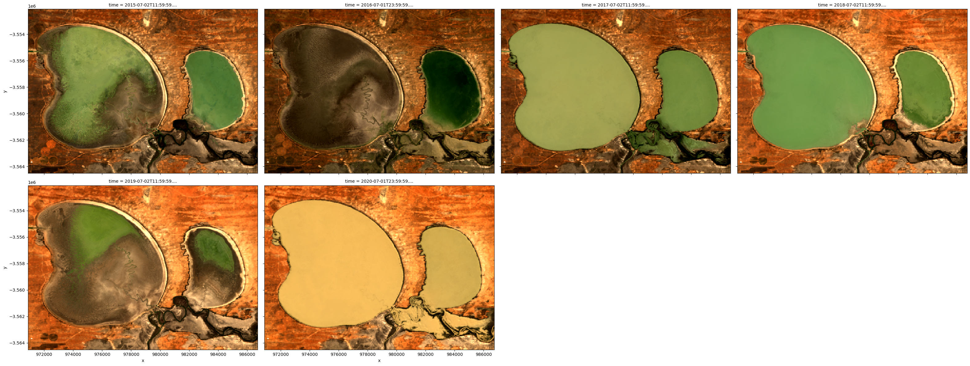
To get a quick idea of what the data looks like, we can plot a selection of observations from the dataset in true colour using the rgb function:
[4]:
# Plot four images from the dataset
rgb(ds, bands=["red", "green", "blue"], col="time")
Plot time series as a RGB/three band animation
The xr_animation function is based on functionality within matplotlib.animation. It takes an xarray.Dataset and exports a one band or three band (e.g. true or false colour) GIF or MP4 animation showing changes in the landscape across time.
['red', 'green', 'blue'] satellite bands to generate a true colour RGB animation.interval, and the width of the animation to 300 pixels using width_pixels:[5]:
# Produce time series animation of red, green and blue bands
xr_animation(
    ds=ds,
    bands=["red", "green", "blue"],
    output_path="animated_timeseries.mp4",
    interval=500,
    width_pixels=300,
)

# Plot animation
plt.close()
Video("animated_timeseries.mp4", embed=True)
Exporting animation to animated_timeseries.mp4
[5]:
We can also use different band combinations (e.g. false colour) using bands, add additional text using show_text, and change the font size using annotation_kwargs, which passes a dictionary of values to the matplotlib plt.annotate function (see matplotlib.pyplot.annotate for options).
The function will automatically select an appropriate colour stretch by clipping the data to remove outliers/extreme values smaller or greater than the 2nd and 98th percentiles (e.g. similar to xarray’s robust=True). This can be controlled further with the percentile_stretch parameter. For example, setting percentile_stretch=(0.01, 0.99) will apply a colour stretch with less contrast:
[6]:
# Produce time series animation of red, green and blue bands
xr_animation(
    ds=ds,
    bands=["swir2", "nir", "green"],
    output_path="animated_timeseries.mp4",
    interval=500,
    width_pixels=300,
    show_text="Time-series animation",
    percentile_stretch=(0.01, 0.99),
    annotation_kwargs={"fontsize": 25},
)

# Plot animation
plt.close()
Video("animated_timeseries.mp4", embed=True)
Exporting animation to animated_timeseries.mp4
[6]:
Plotting single band animations
It is also possible to create a single band animation. For example, we could plot an index like the Normalized Difference Water Index (NDWI), which has high values where a pixel is likely to be open water (e.g. NDWI > 0). In the example below, we calculate NDWI using the calculate_indices function from the DEA_bandindices script.
(By default the colour bar limits are optimised based on percentile_stretch; set percentile_stretch=(0.00, 1.00) to show the full range of values from min to max)
[7]:
# Compute NDWI; `collection='ga_gm_3'` ensures the correct formula
# is applied to our Geomedian data
ds = calculate_indices(ds, index="NDWI", collection="ga_gm_3")

# Produce time series animation of NDWI:
xr_animation(
    ds=ds,
    output_path="animated_timeseries.mp4",
    bands="NDWI",
    show_text="NDWI",
    interval=500,
    width_pixels=300,
)

# Plot animation
plt.close()
Video("animated_timeseries.mp4", embed=True)
Exporting animation to animated_timeseries.mp4
[7]:
We can customise single band animations by specifying parameters using imshow_kwargs, which is passed to the matplotlib plt.imshow function (see https://matplotlib.org/stable/api/_as_gen/matplotlib.pyplot.imshow.html for options). For example, we can use a more appropriate blue colour scheme with 'cmap': 'Blues', and set 'vmin': 0.0, 'vmax': 0.5 to overrule the default colour bar limits:
[8]:
# Produce time series animation using a custom colour scheme and limits:
xr_animation(
    ds=ds,
    bands="NDWI",
    output_path="animated_timeseries.mp4",
    interval=500,
    width_pixels=300,
    show_text="NDWI",
    imshow_kwargs={"cmap": "Blues", "vmin": 0.0, "vmax": 0.5},
    colorbar_kwargs={"colors": "black"},
)

# Plot animation
plt.close()
Video("animated_timeseries.mp4", embed=True)
Exporting animation to animated_timeseries.mp4
[8]:
One band animations show a colour bar by default, but this can be disabled using show_colorbar:
[9]:
# Produce time series animation without a colour bar:
xr_animation(
    ds=ds,
    bands="NDWI",
    output_path="animated_timeseries.mp4",
    interval=500,
    width_pixels=300,
    show_text="NDWI",
    show_colorbar=False,
    imshow_kwargs={"cmap": "Blues", "vmin": 0.0, "vmax": 0.5},
)

# Plot animation
plt.close()
Video("animated_timeseries.mp4", embed=True)
Exporting animation to animated_timeseries.mp4
[9]:
Available output formats
The above examples have generated animated MP4 files, but GIF files can also be generated. The two formats have their own advantages and disadvantages:
.mp4: fast to generate, smallest file sizes and highest quality; suitable for Twitter/social media and recent versions of Powerpoint.gif: slow to generate, large file sizes, low rendering quality; suitable for all versions of Powerpoint and Twitter/social media
Note: To preview a
.mp4file from within JupyterLab, find the file (e.g. ‘animated_timeseries.mp4’) in the file browser on the left, right click, and select ‘Open in New Browser Tab’.
[10]:
# Animate datasets as a GIF file
xr_animation(
    ds=ds,
    bands=["red", "green", "blue"],
    output_path="animated_timeseries.gif",
    interval=500,
)

# Plot animation
plt.close()
Image("animated_timeseries.gif", embed=True)
Exporting animation to animated_timeseries.gif
[10]:
<IPython.core.display.Image object>
Advanced
Adding vector overlays
The animation code supports plotting vector files (e.g. ESRI Shapefiles or GeoJSON) over the top of satellite imagery. To do this, we first load the file using geopandas, and pass this to xr_animation using the show_gdf parameter.
The sample data we use here provides the spatial extent of water in the Menindee Lakes for each year since 2015.
[11]:
# Get shapefile path
poly_gdf = gpd.read_file("../Supplementary_data/Animated_timeseries/vector.geojson")

# Produce time series animation
xr_animation(
    ds=ds,
    bands=["red", "green", "blue"],
    output_path="animated_timeseries.mp4",
    interval=500,
    width_pixels=300,
    show_gdf=poly_gdf,
)

# Plot animation
plt.close()
Video("animated_timeseries.mp4", embed=True)
Exporting animation to animated_timeseries.mp4
[11]:
You can customise styling for vector overlays by including a column called 'color' in the geopandas.GeoDataFrame object. For example, to plot the vector in red:
[12]:
# Assign a colour to the GeoDataFrame
poly_gdf["color"] = "red"

# Produce time series animation
xr_animation(
    ds=ds,
    bands=["red", "green", "blue"],
    output_path="animated_timeseries.mp4",
    interval=500,
    width_pixels=300,
    show_gdf=poly_gdf,
)

# Plot animation
plt.close()
Video("animated_timeseries.mp4", embed=True)
Exporting animation to animated_timeseries.mp4
[12]:
It can also be useful to focus on our vector outline so that it can provide a useful reference point over the top of our imagery. To do this, we can assign our shapefile a semi-transparent colour (in this case, blue), and give them a blue outline using the gdf_kwargs parameter. This allows us to see all four waterbody features in our vector dataset:
Note: To make a vector completely transparent, set its colour to ‘None’.
[13]:
# Assign a semi-transparent colour to the GeoDataFrame
poly_gdf["color"] = "#0066ff26"

# Produce time series animation
xr_animation(
    ds=ds,
    bands=["red", "green", "blue"],
    output_path="animated_timeseries.mp4",
    interval=500,
    width_pixels=300,
    show_gdf=poly_gdf,
    gdf_kwargs={"edgecolor": "blue"},
)

# Plot animation
plt.close()
Video("animated_timeseries.mp4", embed=True)
Exporting animation to animated_timeseries.mp4
[13]:
Plotting vectors by time
It can be useful to plot vector features over the top of imagery at specific times in an animation. For example, we may want to plot our four waterbody features at specific times that match up with our imagery so we can visualise how our lake changed in size over time.
To do this, we can create new start_time and end_time columns in our geopandas.GeoDataFrame that tell xr_animation when to plot each feature over the top of our imagery:
Note: Dates can be provided in any string format that can be converted using the pandas.to_datetime(). For example,
'2009','2009-11','2009-11-01'etc. Thestart_timeandend_timecolumns are both optional, and will default to the first and last timestep in the animation respectively if not provided.
[14]:
# Assign start and end times to each feature
poly_gdf["start_time"] = ["2015", "2016", "2017", "2018", "2019", "2020"]
poly_gdf["end_time"] = ["2016", "2017", "2018", "2019", "2020", "2021"]

# Preview the updated geopandas.GeoDataFrame
poly_gdf
[14]:
| year | geometry | color | start_time | end_time | |
|---|---|---|---|---|---|
| 0 | 2015 | MULTIPOLYGON (((142.51951 -32.25654, 142.51951... | #0066ff26 | 2015 | 2016 |
| 1 | 2016 | MULTIPOLYGON (((142.57690 -32.31206, 142.57692... | #0066ff26 | 2016 | 2017 |
| 2 | 2017 | MULTIPOLYGON (((142.40301 -32.25457, 142.40301... | #0066ff26 | 2017 | 2018 |
| 3 | 2018 | MULTIPOLYGON (((142.52004 -32.25543, 142.52007... | #0066ff26 | 2018 | 2019 |
| 4 | 2019 | MULTIPOLYGON (((142.52626 -32.25312, 142.52626... | #0066ff26 | 2019 | 2020 |
| 5 | 2020 | POLYGON ((142.40301 -32.25457, 142.40301 -32.2... | #0066ff26 | 2020 | 2021 |
We can now pass the updated geopandas.GeoDataFrame to xr_animation:
[15]:
# Produce time series animation
xr_animation(ds=ds,
             bands=['red', 'green', 'blue'],
             output_path='animated_timeseries.mp4',
             interval=500,
             width_pixels=300,
             show_gdf=poly_gdf,
             gdf_kwargs={'edgecolor': 'blue'})

# Plot animation
plt.close()
Video('animated_timeseries.mp4', embed=True)
Exporting animation to animated_timeseries.mp4
[15]:
Custom image processing functions
The image_proc_funcs parameter allows you to pass custom image processing functions that will be applied to each frame of your animation as they are rendered. This can be a powerful way to produce visually appealing animations - some example applications include:
Improving brightness, saturation or contrast
Sharpening your images
Histogram matching or equalisation
To demonstrate this, we will apply two functions from the skimage.exposure module which contains many powerful image processing algorithms:
skimage.exposure.rescale_intensitywill first scale our data between 0.0 and 1.0 (required for step 2)skimage.exposure.equalize_adapthistwill take this re-scaled data and apply an alogorithm that will enhance and contrast local details of the image
Note: Functions supplied to
image_proc_funcsare applied one after another to each timestep inds(e.g. each frame in the animation). Any custom function can be supplied toimage_proc_funcs, providing it both accepts and outputs anumpy.ndarraywith a shape of(y, x, bands).
[16]:
# List of custom functions to apply
custom_funcs = [skimage.exposure.rescale_intensity,
                skimage.exposure.equalize_adapthist]

# Animate data after applying custom image processing functions to each frame
xr_animation(ds=ds,
             bands=['red', 'green', 'blue'],
             output_path='animated_timeseries.mp4',
             image_proc_funcs=custom_funcs,
             interval=500)

# Plot animation
plt.close()
Video('animated_timeseries.mp4', embed=True)
Applying custom image processing functions
Exporting animation to animated_timeseries.mp4
[16]:
Additional information
License: The code in this notebook is licensed under the Apache License, Version 2.0. Digital Earth Australia data is licensed under the Creative Commons by Attribution 4.0 license.
Contact: If you need assistance, please post a question on the Open Data Cube Slack channel or on the GIS Stack Exchange using the open-data-cube tag (you can view previously asked questions here). If you would like to report an issue with this notebook, you can file one on
GitHub.
Last modified: December 2023
Compatible datacube version:
[17]:
print(datacube.__version__)
1.8.12
Tags
Tags: NCI compatible, sandbox compatible, annual geomedian, rgb, xr_animation, matplotlib.animation, NDWI, animation, GeoPandas