Classifying satellite data 
Sign up to the DEA Sandbox to run this notebook interactively from a browser
Compatibility: Notebook currently compatible with the
DEA SandboxenvironmentProducts used: ga_ls8c_nbart_gm_cyear_3, ga_ls_fc_pc_cyear_3
Description
Having succesfully run the 3_Evaluate_optimize_fit_classifier notebook, we can now use our classification model to predict values on new satellite data. This notebook will guide you through loading satellite data from the ODC, computing the same feature layers as we did in the first notebook when we extracted training data from the ODC, and using our model to classifying the satellite data. Initially we classify a few small regions to visualize how well our model is performing. The notebook
will then attempt to classify a much larger region and save the results to disk as a Cloud-Optimized GeoTIFF (COG).
The steps are as follows: 1. Open the model we output in the previous notebook, 3_Evaluate_optimize_fit_classifier 2. Redefine the feature layer function that we used to extract training data from the ODC in the first notebook, 1_Extract_training_data 3. Loop through a set of small test locations extracting satellite data from the ODC, then compute the feature layers and classify the data using our model. 4. Plot the results of classifying our small test locations 5. Define a new, much
larger location to load from the ODC and classify using the same model 6. Save our results to disk as a COG
Getting started
To run this analysis, run all the cells in the notebook, starting with the “Load packages” cell.
Load Packages
[1]:
import datacube
import xarray as xr
from joblib import load
import matplotlib.pyplot as plt
from odc.geo.xr import write_cog

import sys
sys.path.insert(1, '../../Tools/')
from dea_tools.datahandling import load_ard
from dea_tools.plotting import rgb, display_map
from dea_tools.bandindices import calculate_indices
from dea_tools.classification import predict_xr
from dea_tools.dask import create_local_dask_cluster

import warnings
warnings.filterwarnings("ignore")
Set up a dask cluster
This will help keep our memory use down and conduct the analysis in parallel. If you’d like to view the dask dashboard, click on the hyperlink that prints below the cell. You can use the dashboard to monitor the progress of calculations.
[2]:
create_local_dask_cluster()
Client
Client-26c2b23f-99b4-11f0-9696-968cf0741d4f
| Connection method: Cluster object | Cluster type: distributed.LocalCluster |
| Dashboard: /user/chad.burton@ga.gov.au/proxy/8787/status |
Cluster Info
LocalCluster
972657b5
| Dashboard: /user/chad.burton@ga.gov.au/proxy/8787/status | Workers: 1 |
| Total threads: 2 | Total memory: 14.25 GiB |
| Status: running | Using processes: True |
Scheduler Info
Scheduler
Scheduler-b02c1172-b57e-41c8-8334-d53a317fa419
| Comm: tcp://127.0.0.1:45567 | Workers: 0 |
| Dashboard: /user/chad.burton@ga.gov.au/proxy/8787/status | Total threads: 0 |
| Started: Just now | Total memory: 0 B |
Workers
Worker: 0
| Comm: tcp://127.0.0.1:36243 | Total threads: 2 |
| Dashboard: /user/chad.burton@ga.gov.au/proxy/39611/status | Memory: 14.25 GiB |
| Nanny: tcp://127.0.0.1:44277 | |
| Local directory: /tmp/dask-scratch-space/worker-ojde1_12 | |
Analysis parameters
model_path: The path to the location where the model exported from the previous notebook is storedtesting_locations: A dictionary with values containing latitude and longitude points, and keys representing a unique ID to identify the locations. Thelatandlonpoints define the center of the satellite images we will load for running small test classificationsbuffer: The number of degrees to load around the central latitude and longitude points inlocations. This number here will depend on the compute/RAM available on the Sandbox instance, and the type and number of feature layers calculated. A value of0.1(which results in a 0.2 x 0.2 degree analysis extent) usually works well on the default Sandbox instance.dask_chunks: Dask works by breaking up large datasets into chunks, which can be read individually.This parameter specifies the size of the chunks in numbers of pixels, e.g.{'x':1000,'y':1000}results: A folder location to store the classified GeoTIFFs
[3]:
model_path = 'results/ml_model.joblib'

testing_locations = {
    'Margaret River': (-33.943, 115.225),
    'Narrogin': (-32.962, 117.136),
    'Geraldton': (-28.850, 114.746),
    'Ravensthorpe': (-33.5048, 119.839),
}

buffer = 0.125

dask_chunks = {'x': 1000, 'y': 1000}

results = 'results/'
Connect to the datacube
[4]:
dc = datacube.Datacube(app='Classify_satellite_data')
Import the model
The code below will also re-open the training data we exported from 3_Evaluate_optimize_fit_classifier.ipynb and grab the column names (features we selected).
[5]:
model = load(model_path).set_params(n_jobs=1)
Making a prediction
Redefining the feature layer function
Because we elected to use all the features extracted in 1_Extract_training_data.ipynb, we can simply copy-and-paste the feature_layers function from the first notebook Extracting_training_data into the cell below (this has already been done for you).
If you’re using this notebook to run your own classifications (i.e. not running the default example), then you’ll need to redefine the feature layer function below, taking care to match the features in the trained model. For example, if you conducted feature selection and removed features from the model, then you’ll need to mimic that process here by removing features in the prediction data. In short, the features in the model must precisely match those in the data you’re classifying.
[6]:
def feature_layers(query):

    # Connect to the datacube
    dc = datacube.Datacube(app='custom_feature_layers')

    # Load ls8 geomedian
    ds = dc.load(product='ga_ls8cls9c_gm_cyear_3',
                 **query)

    # Calculate some band indices
    da = calculate_indices(ds,
                           index=['NDVI', 'MNDWI'],
                           drop=False,
                           collection='ga_ls_3')

    # Add Fractional cover percentiles
    fc = dc.load(product='ga_ls_fc_pc_cyear_3',
                 measurements=['pv_pc_10', 'pv_pc_50', 'pv_pc_90'], # only the PV band
                 like=ds.geobox, # will match geomedian extent
                 time=query.get('time'),  # use time if in query
                 dask_chunks=query.get('dask_chunks')  # use dask if in query
                )

    # Merge results into single dataset
    result = xr.merge([da, fc], compat='override')

    return result
Set up datacube query
These query options should match the query params in 1_Extract_training_data.ipynb, unless there are measurements that no longer need to be loaded because they were dropped during a feature selection process (which has not been done in the default example).
Note: Because we are using Dask to help us scale the operations, we now add a new
dask_chunksparameter to our query.
[7]:
# Set up our inputs to collect_training_data
time = ('2014')
zonal_stats = 'median'
return_coords = True

# Set up the inputs for the ODC query
resolution = (-30, 30)
output_crs = 'EPSG:3577'
[8]:
# Generate a new datacube query object
query = {
    'time': time,
    'resolution': resolution,
    'output_crs': output_crs,
    'dask_chunks': dask_chunks
}
Loop through test locations and predict
For every location we listed in the test_locations dictionary, we calculate the feature layers, and then use the DEA function predict_xr to classify the data.
The predict_xr function is an xarray wrapper around the sklearn estimator .predict() and .predict_proba() methods, and relies on dask-ml ParallelPostfit to run the predictions with dask. Predict_xr can compute predictions, prediction probabilites, and return the input feature layers. Read the documentation for more insights
into this function’s capabilities.
[9]:
predictions = []

for key, value in testing_locations.items():

    print('Working on: ' + key)

    bounds = {'x': (value[1] - buffer, value[1] + buffer),
            'y': (value[0] + buffer, value[0] - buffer)}

    # Update datacube query
    query.update(bounds)

    # Load data and calculate features
    data = feature_layers(query).squeeze()

    # Predict using the imported model
    predicted = predict_xr(model,
                           data,
                           proba=True,
                           return_input=True
                          ).compute()

    predictions.append(predicted)
Working on: Margaret River
predicting...
   probabilities...
   returning single probability band
   input features...
Working on: Narrogin
predicting...
   probabilities...
   returning single probability band
   input features...
Working on: Geraldton
predicting...
   probabilities...
   returning single probability band
   input features...
Working on: Ravensthorpe
predicting...
   probabilities...
   returning single probability band
   input features...
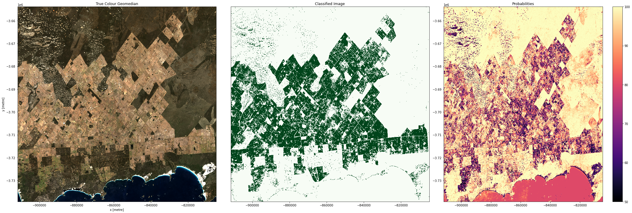
Plotting results
In the plots below you’ll see on the left a true-colour image of the region, in the centre, the classified image (green = crop, white = non-crop), and on the right an image of the prediction probabilities. Because we are using a Random Forest Classifier, the prediction probabilities refer to the percentage of trees that voted for the resulting classification. For example, if the model had 200 decision trees in the random forest, and 150 of the trees voted ‘crop’, the prediction probability is 150 / 200 x 100 = 75 %
[10]:
for i in range(0, len(predictions)):
    fig, axes = plt.subplots(1, 3, figsize=(
        24, 8), sharey=True, layout='constrained')

    # Plot true colour image
    rgb(predictions[i],
        ax=axes[0],
        percentile_stretch=(0.01, 0.99))

    # Plot classified image
    predictions[i].Predictions.plot(ax=axes[1],
                                    cmap='Greens',
                                    add_labels=False,
                                    add_colorbar=False)

    predictions[i].Probabilities.where(predictions[i].Predictions == 1).plot(
         ax=axes[2],
         cmap='magma',
         vmin=50,
         vmax=100,
         add_labels=False,
         add_colorbar=True
    )

    # Remove axis on right plot
    axes[2].get_yaxis().set_visible(False)

    # Add plot titles
    axes[0].set_title('True Colour Geomedian')
    axes[1].set_title('Classified Image (cropland)')
    axes[2].set_title('Probabilities');
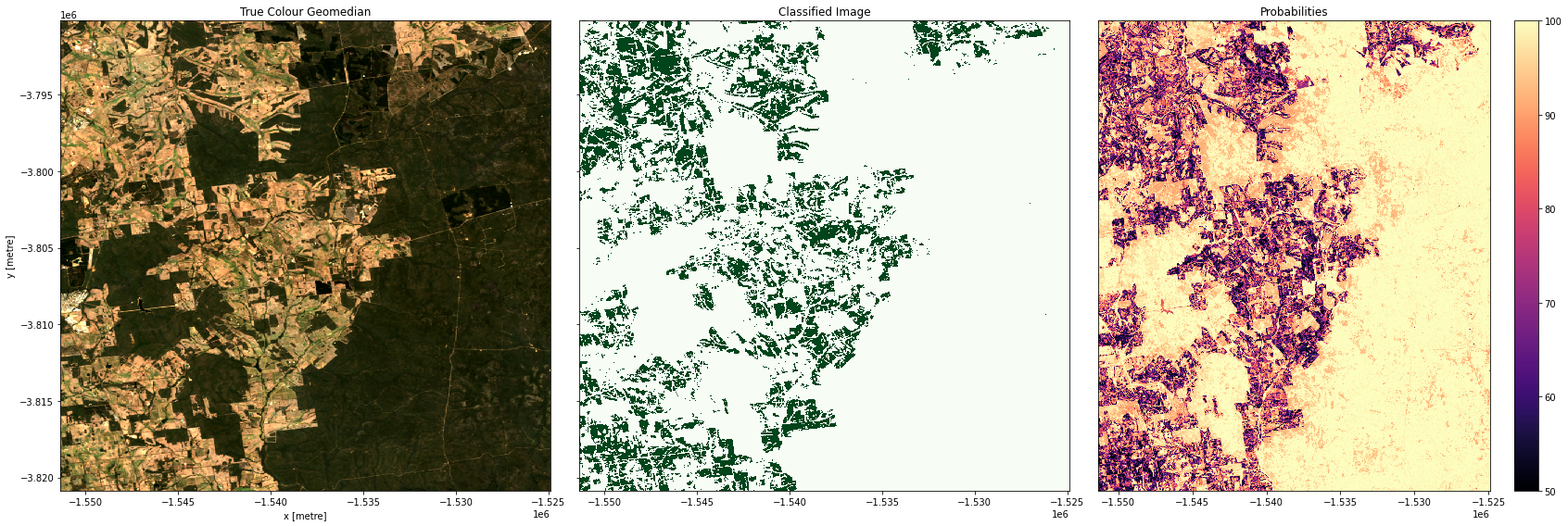
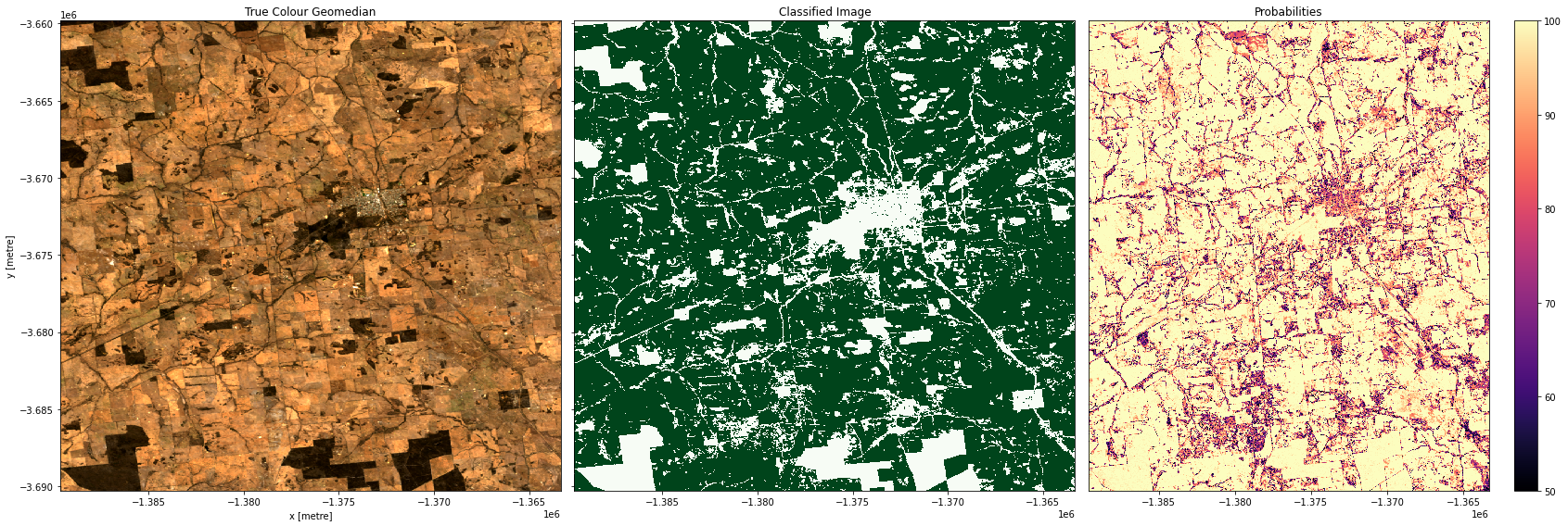
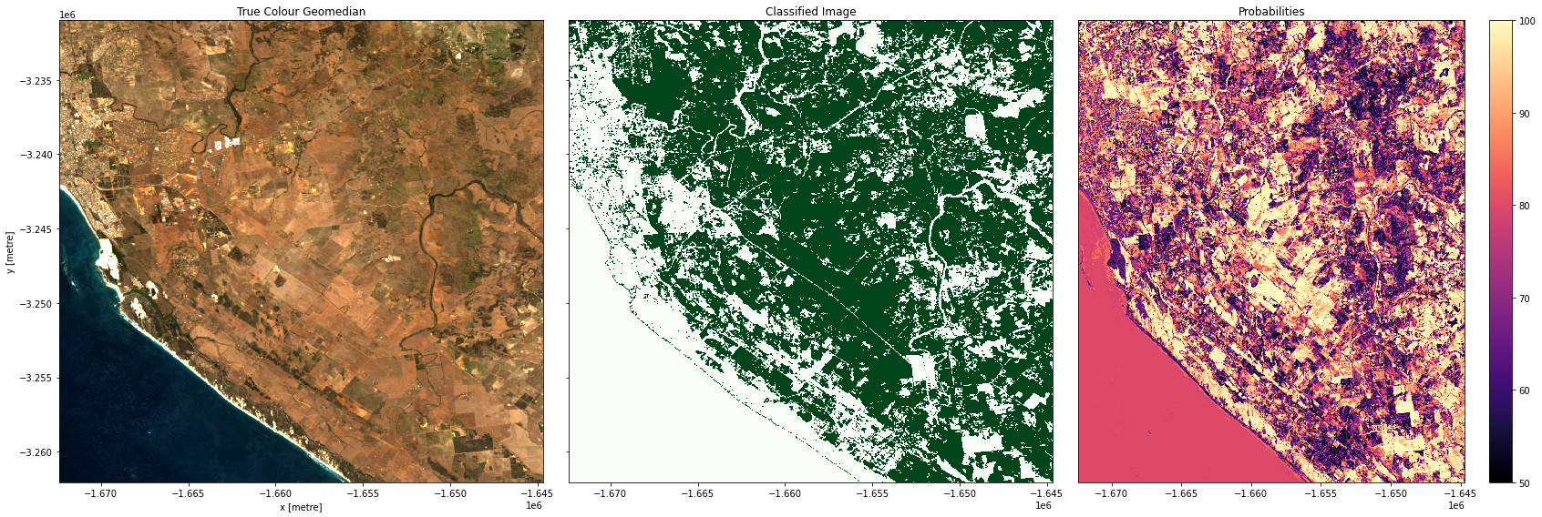
Examining our test areas, we can see that most obvious cropping areas have been captured by the model. However, in Geraldton (3rd row), some of the coastal sand dunes have been included in the ‘crop’ label. This could mean we need to gather more training labels from these locations to provide the classifier with more counter-examples to cropping, or it could mean we don’t have the appropriate feature layers for the classifier to distinguish the high-albedo coastal sands from cropping. Running extensive tests of this kind is the best way to determine the strengths and limitations of your classifier.
Large scale classification
If you’re happy with the results of the test locations, then attempt to classify a large region by re-entering a new latitude, longitude and larger buffer size. You may need to adjust the dask_chunks size to optimize for the larger region. If you do change the chunk size, then remember to adjust the chunks in the feature layer function above (i.e. in the default example custom_reduce_function)
The cell directly below will first clear the test location results from memory, so we have enough RAM to run a much larger prediction.
[11]:
# Clear objects from memory
del data
del predictions
del predicted
Enter a new set of coordinates and larger buffer size below. You can use the display_map() cell to see an outline of the area you’ll be classifying. The default example is to the east of Esperance, WA. Try to keep the buffer size below 0.5, any larger than this and the default sandbox will begin running out of RAM, which interrupts the calculation.
[12]:
new_lat, new_lon = -33.5917, 122.6911  # near Esperance, WA
buf_lat, buf_lon = 0.35, 0.55
dask_chunks = {'x': 1000, 'y': 1000}
[13]:
display_map((new_lon - buf_lon, new_lon + buf_lon),
            (new_lat + buf_lat, new_lat - buf_lat))
[13]:
We will now classify the region specified above:
[14]:
# Update datacube query object with new bounds
bounds = {
    "x": (new_lon - buf_lon, new_lon + buf_lon),
    "y": (new_lat + buf_lat, new_lat - buf_lat),
}

query.update(bounds)

# Calculate features lazily
data = feature_layers(query)

# Predict using the imported model
predicted = predict_xr(
    model,
    data,
    proba=True,
    return_input=True
).compute()
predicting...
   probabilities...
   returning single probability band
   input features...
Write the results to GeoTIFFs
Our predictions and prediction probabilites are written to disk as Cloud-Optimised GeoTIFFs. In addition to exporting the predictions, we will also export one of the feature layers, NDVI. In the next notebook, 5_Object-based_filtering, we will look at using image segmentation to clean up the pixel-based results. The NDVI layer will provide an input to the image segmentation algorithm.
[15]:
write_cog(predicted.Predictions, results+'prediction.tif', overwrite=True)
write_cog(predicted.Probabilities, results+'probabilities.tif', overwrite=True)
write_cog(predicted.NDVI, results + 'NDVI.tif', overwrite=True);
[15]:
PosixPath('results/NDVI.tif')
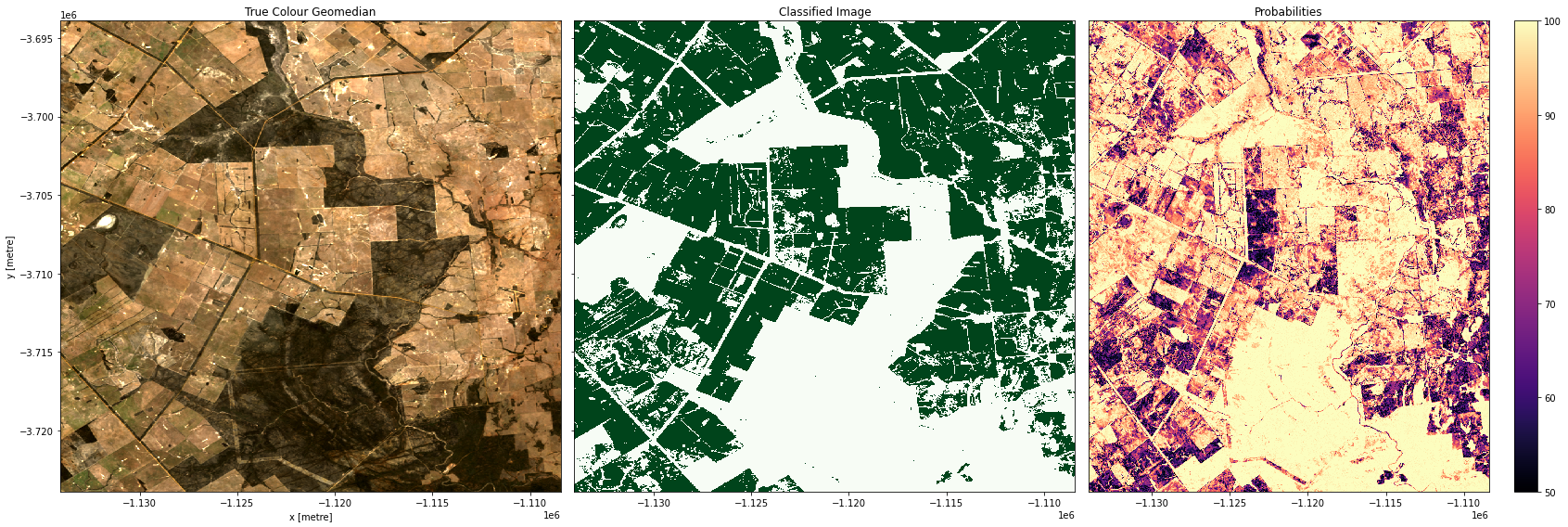
Plot the result
Below, we will plot our pixel based cropland mask for the region to the east of Esperance, WA.
Note: This could crash the kernel if the region is very large, but should be fine if you’re using the default example.
[16]:
fig, axes = plt.subplots(1, 3, figsize=(30, 9), layout='constrained', sharey=True)

# Plot true colour image
rgb(predicted,
    ax=axes[0],
    percentile_stretch=(0.01, 0.99))

# Plot classified image
predicted.Predictions.plot(ax=axes[1],
                           cmap='Greens',
                           add_labels=False,
                           add_colorbar=False
                          )

predicted.Probabilities.where(predicted.Predictions == 1).plot(ax=axes[2],
                             cmap='magma',
                             vmin=50,
                             vmax=100,
                             add_labels=False,
                             add_colorbar=True)

# Remove axis on right plot
axes[1].get_yaxis().set_visible(False)

# Add plot titles
axes[0].set_title('True Colour Geomedian', fontsize=15)
axes[1].set_title('Classified Image (cropland)', fontsize=15)
axes[2].set_title('Probabilities', fontsize=15);
Conclusions
Congratulations, you have successfully created a cropland model for Western Australia! If you’re perfectly happy with the results, then this pixel-based classification can be the final point in your workflow. However, in reality, ML workflows like the one you’ve just been through are an iterative process. If we weren’t happy with the classifications, then we have a few options to improve the model:
Conduct feature selection to remove features that might be confounding our model.
Consider adding new features to the model. This would require editing and re-running the
collect_training_datafunction in the Extracting_training_data notebook to add new features to our training dataset.Try using a different model (e.g. instead of using a Random Forest Classifier we could use a Support Vector Machine - this will require editing and re-running the Evaluate_optimize_fit_classifier notebook).
Collect more training data in the regions where our classifier is doing poorly. This can be done through the platforms suggested in Extracting_training_data.
We can also potentially improve our classifications by moving to the next notebook in this series. The next notebook explores converting the pixel-based classification into an object-based classification using an image segmentation algorithm.
Recommended next steps
To continue working through the notebooks in this Scalable Machine Learning on the ODC workflow, go to the next notebook 5_Object-based_filtering.ipynb.
Classifying satellite data (this notebook)
Additional information
License: The code in this notebook is licensed under the Apache License, Version 2.0. Digital Earth Australia data is licensed under the Creative Commons by Attribution 4.0 license.
Contact: If you need assistance, please post a question on the Open Data Cube Discord chat or on the GIS Stack Exchange using the open-data-cube tag (you can view previously asked questions here). If you would like to report an issue with this notebook, you can file one on
GitHub.
Last modified: September 2025
Compatible datacube version:
[17]:
print(datacube.__version__)
1.9.9
Tags
Tags: Landsat 8 geomedian, Landsat 8 TMAD, machine learning, predict_xr