Monitoring coastal erosion along Australia’s coastline 
Sign up to the DEA Sandbox to run this notebook interactively from a browser
Compatibility: Notebook currently compatible with both the
DEA Sandboxenvironment onlyProducts used: ga_ls5t_ard_3, ga_ls7e_ard_3, ga_ls8c_ard_3, ga_ls9c_ard_3
Prerequisites: For more information about the methods used in this analysis, refer to the DEA Coastlines and Tidal modelling notebooks
Background
Over 40% of the world’s population lives within 100 km of the coastline. However, coastal environments are constantly changing, with erosion and coastal change presenting a major challenge to valuable coastal infrastructure and important ecological habitats. Up-to-date data on coastal change and erosion is essential for coastal managers to be able to identify and minimise the impacts of coastal change and erosion.
Monitoring coastlines and rivers using field surveys can be challenging and hazardous, particularly at regional or national scale. Aerial photography and LiDAR can be used to monitor coastal change, but this is often expensive and requires many repeated flights over the same areas of coastline to build up an accurate history of how the coastline has changed across time.
Digital Earth Australia use case
Imagery from satellites such as the NASA/USGS Landsat program is available for free for the entire planet, making satellite imagery a powerful and cost-effective tool for monitoring coastlines and rivers at regional or national scale. By identifying and extracting the precise boundary between water and land based on satellite data, it is possible to extract accurate shorelines that can be compared across time to reveal hotspots of erosion and coastal change.
The usefulness of satellite imagery in the coastal zone can be affected by the presence of clouds, sun-glint over water, poor water quality (e.g. sediment) and the influence of tides. The effect of these factors can be reduced by combining individual noisy images into cleaner “summary” or composite layers, and filtering the data to focus only on images taken at certain tidal conditions (e.g. mid tide).
Recently, Geoscience Australia combined 32 years of Landsat data from the Digital Earth Australia archive with tidal modelling to produce Digital Earth Australia Coastlines, a continental dataset providing annual shorelines and rates of change along the entire Australian coastline from 1988 to the present (for more information, run the DEA Coastlines notebook, explore the dataset on the interactive DEA Maps platform, or read the scientific paper in Remote Sensing of Environment).
Description
In this example, we demonstrate a simplified version of the DEA Coastlines method that combines data from the Landsat 5, 7 and 8 satellites with image compositing and tide filtering techniques to accurately map shorelines across time and identify areas that have changed significantly between 2000 and 2020. This example demonstrates how to:
Load cloud-free Landsat time series data
Compute a water index (MNDWI)
Filter images by tide height
Create “summary” or composite images for given time periods
Extract and visualise shorelines across time
Getting started
To run this analysis, run all the cells in the notebook, starting with the “Load packages” cell.
After finishing the analysis, return to the “Analysis parameters” cell, modify some values (e.g. choose a different location or time period to analyse) and re-run the analysis. There are additional instructions on modifying the notebook at the end.
Load packages
Load key Python packages and supporting functions for the analysis.
[1]:
%matplotlib inline

import datacube
import xarray as xr
import pandas as pd
import numpy as np
import matplotlib.pyplot as plt
from eo_tides.eo import tag_tides

import sys
sys.path.insert(1, '../Tools/')
from dea_tools.datahandling import load_ard, mostcommon_crs
from dea_tools.plotting import rgb, display_map
from dea_tools.bandindices import calculate_indices
from dea_tools.spatial import subpixel_contours
from dea_tools.dask import create_local_dask_cluster

# Create local dask cluster to improve data load time
client = create_local_dask_cluster(return_client=True)
Client
Client-15f55ba0-5e01-11f0-859b-ceab8fbfa632
| Connection method: Cluster object | Cluster type: distributed.LocalCluster |
| Dashboard: /user/robbi.bishoptaylor@ga.gov.au/proxy/8787/status |
Cluster Info
LocalCluster
03184cbf
| Dashboard: /user/robbi.bishoptaylor@ga.gov.au/proxy/8787/status | Workers: 1 |
| Total threads: 15 | Total memory: 117.21 GiB |
| Status: running | Using processes: True |
Scheduler Info
Scheduler
Scheduler-1046afb7-2703-423e-85d9-9491817cf706
| Comm: tcp://127.0.0.1:32927 | Workers: 1 |
| Dashboard: /user/robbi.bishoptaylor@ga.gov.au/proxy/8787/status | Total threads: 15 |
| Started: Just now | Total memory: 117.21 GiB |
Workers
Worker: 0
| Comm: tcp://127.0.0.1:37351 | Total threads: 15 |
| Dashboard: /user/robbi.bishoptaylor@ga.gov.au/proxy/38305/status | Memory: 117.21 GiB |
| Nanny: tcp://127.0.0.1:36597 | |
| Local directory: /tmp/dask-scratch-space/worker-92p2fz6t | |
Connect to the datacube
Activate the datacube database, which provides functionality for loading and displaying stored Earth observation data.
[2]:
dc = datacube.Datacube(app='Coastal_erosion')
Analysis parameters
The following cell set important parameters for the analysis:
lat_range: The latitude range to analyse (e.g.(-27.71, -27.75)). For reasonable load times, keep this to a range of ~0.1 degrees or less.lon_range: The longitude range to analyse (e.g.(153.42, 153.46)). For reasonable load times, keep this to a range of ~0.1 degrees or less.time_range: The date range to analyse (e.g.('1990', '2020'))time_step: This parameter allows us to choose the length of the time periods we want to compare: e.g. shorelines for each year, or shorelines for each six months etc.1YEwill generate one coastline for every year in the dataset;6Mwill produce a coastline for every six months, etc.tide_range: The minimum and maximum proportion of the tidal range to include in the analysis. For example,tide_range = (0.25, 0.75)will exclude the lowest and highest 25% of tides by selecting only satellite images taken at mid-tide (e.g. tides greater than the 25th percentile and less than the 75th percentile of all observed tide heights). This allows you to seperate the effect of erosion from the influence of tides by producing shorelines for specific tidal conditions (e.g. low tide, mid tide, high tide shorelines etc).
If running the notebook for the first time, keep the default settings below. This will demonstrate how the analysis works and provide meaningful results. The example explores coastal change in the Jumpinpin Channel between North and South Stradbroke Islands in south-eastern Queensland.
To ensure that the tidal modelling part of this analysis works correctly, please make sure the centre of the study area is located over water when setting lat_range and lon_range.
[3]:
lat_range = (-27.71, -27.75)
lon_range = (153.425, 153.465)
time_range = ('2000', '2020')
time_step = '1YE'
tide_range = (0.25, 0.75)
View the selected location
The next cell will display the selected area on an interactive map. Feel free to zoom in and out to get a better understanding of the area you’ll be analysing. Clicking on any point of the map will reveal the latitude and longitude coordinates of that point.
[4]:
display_map(x=lon_range, y=lat_range)
[4]:
Load cloud-masked Landsat data
The first step in this analysis is to load in Landsat data for the lat_range, lon_range and time_range we provided above. The code below first connects to the datacube database, and then uses the load_ard function to load in data from the Landsat 5, 7 and 8 satellites for the area and time included in lat_range, lon_range and time_range. The function will also automatically mask out clouds from the dataset, allowing us to focus on pixels that contain useful data:
[5]:
# Create the 'query' dictionary object, which contains the longitudes,
# latitudes and time provided above
query = {
    'y': lat_range,
    'x': lon_range,
    'time': time_range,
    'measurements': ['nbart_red', 'nbart_green', 'nbart_blue', 'nbart_swir_1'],
    'resolution': (-30, 30),
}

# Identify the most common projection system in the input query
output_crs = mostcommon_crs(dc=dc, product='ga_ls8c_ard_3', query=query)

# Load available data from all three Landsat satellites
landsat_ds = load_ard(dc=dc,
                      products=['ga_ls5t_ard_3',
                                'ga_ls7e_ard_3',
                                'ga_ls8c_ard_3',
                                'ga_ls8c_ard_3'],
                      output_crs=output_crs,
                      align=(15, 15),
                      group_by='solar_day',
                      dask_chunks={},
                      **query)
Finding datasets
    ga_ls5t_ard_3
    ga_ls7e_ard_3
    ga_ls8c_ard_3
Applying fmask pixel quality/cloud mask
Returning 724 time steps as a dask array
Once the load is complete, examine the data by printing it in the next cell. The Dimensions argument revels the number of time steps in the data set, as well as the number of pixels in the x (longitude) and y (latitude) dimensions.
[6]:
landsat_ds
[6]:
<xarray.Dataset> Size: 230MB
Dimensions:       (time: 724, y: 149, x: 133)
Coordinates:
  * time          (time) datetime64[ns] 6kB 2000-01-26T23:34:55.629134 ... 20...
  * y             (y) float64 1kB -3.065e+06 -3.065e+06 ... -3.07e+06 -3.07e+06
  * x             (x) float64 1kB 5.419e+05 5.419e+05 ... 5.458e+05 5.458e+05
    spatial_ref   int32 4B 32656
Data variables:
    nbart_red     (time, y, x) float32 57MB dask.array<chunksize=(1, 149, 133), meta=np.ndarray>
    nbart_green   (time, y, x) float32 57MB dask.array<chunksize=(1, 149, 133), meta=np.ndarray>
    nbart_blue    (time, y, x) float32 57MB dask.array<chunksize=(1, 149, 133), meta=np.ndarray>
    nbart_swir_1  (time, y, x) float32 57MB dask.array<chunksize=(1, 149, 133), meta=np.ndarray>
Attributes:
    crs:           epsg:32656
grid_mapping: spatial_refPlot example timestep in true colour
To visualise the data, use the pre-loaded rgb utility function to plot a true colour image for a given time-step. White areas indicate where clouds or other invalid pixels in the image have been masked.
Change the value for timestep and re-run the cell to plot a different timestep (timesteps are numbered from 0 to n_time - 1 where n_time is the total number of timesteps; see the time listing under the Dimensions category in the dataset print-out above).
[7]:
# Set the timesteps to visualise
timestep = 7

# Generate RGB plots at each timestep
rgb(landsat_ds,
    index=timestep,
    percentile_stretch=(0.00, 0.95))

Compute Modified Normalised Difference Water Index
To extract shoreline locations, we need to be able to seperate water from land in our study area. To do this, we can use our Landsat data to calculate a water index called the Modified Normalised Difference Water Index, or MNDWI. This index uses the ratio of green and mid-infrared radiation to identify the presence of water (Xu
2006). The formula is:
where Green is the green band and MIR is the mid-infrared band. For Landsat, we can use the Short-wave Infrared (SWIR) 1 band as our measure for MIR.
When it comes to interpreting the index, High values (greater than 0, blue colours) typically represent water pixels, while low values (less than 0, red colours) represent land. You can use the cell below to calculate and plot one of the images after calculating the index.
[8]:
# Calculate the water index
landsat_ds = calculate_indices(landsat_ds, index='MNDWI',
                               collection='ga_ls_3')

# Plot the resulting image for the same timestep selected above
landsat_ds.MNDWI.isel(time=timestep).plot(cmap='RdBu',
                                          size=6,
                                          aspect=1,
                                          vmin=-0.8,
                                          vmax=0.8)
[8]:
<matplotlib.collections.QuadMesh at 0x7f59fc7cc670>
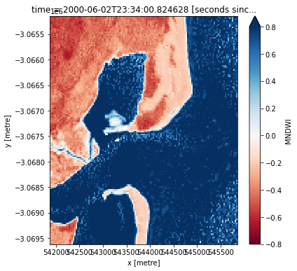
How does the plot of the index compare to the optical image from earlier? Was there water or land anywhere you weren’t expecting?
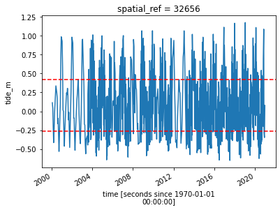
Model tide heights
The location of the shoreline can vary greatly from low to high tide. In the code below, we aim to reduce the effect of tides by modelling tide height data, and keeping only the satellite images that were taken at specific tidal conditions. For example, if tide_range = (0.25, 0.75), we are telling the analysis to focus only on satellite images taken at mid-tide (e.g. when the tide was between the lowest 25th percentile and highest 75th percentile of tide heights).
The tag_tides function below from the eo-tides Python package uses global ocean tide models to calculate the height of the tide at the exact moment each satellite image in our dataset was taken, and adds this as a new tide_height attribute in our dataset (for more information about this function, refer to the Tidal modelling notebook).
Note: this function can only model tides correctly if the centre of your study area is located over water. If this isn’t the case, you can specify a custom tide modelling location by passing a coordinate to
tidepost_latandtidepost_lon(e.g.tidepost_lat=-27.73, tidepost_lon=153.46).
[9]:
# Calculate tides for each timestep in the satellite dataset
landsat_ds["tide_height"] = tag_tides(
    data=landsat_ds,
    model="FES2014",
    directory="/var/share/tide_models/")

# Print the output dataset with new `tide_height` variable
landsat_ds
Setting tide modelling location from dataset centroid: 153.45, -27.73
Modelling tides with FES2014
[9]:
<xarray.Dataset> Size: 287MB
Dimensions:       (time: 724, y: 149, x: 133)
Coordinates:
  * time          (time) datetime64[ns] 6kB 2000-01-26T23:34:55.629134 ... 20...
  * y             (y) float64 1kB -3.065e+06 -3.065e+06 ... -3.07e+06 -3.07e+06
  * x             (x) float64 1kB 5.419e+05 5.419e+05 ... 5.458e+05 5.458e+05
    spatial_ref   int32 4B 32656
    tide_model    <U7 28B 'FES2014'
Data variables:
    nbart_red     (time, y, x) float32 57MB dask.array<chunksize=(1, 149, 133), meta=np.ndarray>
    nbart_green   (time, y, x) float32 57MB dask.array<chunksize=(1, 149, 133), meta=np.ndarray>
    nbart_blue    (time, y, x) float32 57MB dask.array<chunksize=(1, 149, 133), meta=np.ndarray>
    nbart_swir_1  (time, y, x) float32 57MB dask.array<chunksize=(1, 149, 133), meta=np.ndarray>
    MNDWI         (time, y, x) float32 57MB dask.array<chunksize=(1, 149, 133), meta=np.ndarray>
    tide_height   (time) float32 3kB 0.1062 0.05631 -0.2376 ... -0.3709 0.09145
Attributes:
    crs:           epsg:32656
grid_mapping: spatial_refNow that we have modelled tide heights, we can plot them to visualise the range of tide that was captured by Landsat across our time series. In the plot below, red dashed lines also show the subset of the tidal range we selected using the tide_range parameter. The plot should make it clear that limiting the range of the tides for the analysis should give you more consistent results. A large variance in the tide height could obscure your results, so consistency is critical as you want to
compare the change in the shoreline from year to year.
[10]:
# Calculate the min and max tide heights to include based on the % range
min_tide, max_tide = landsat_ds.tide_height.quantile(tide_range)

# Plot the resulting tide heights for each Landsat image:
landsat_ds.tide_height.plot()
plt.axhline(min_tide, c='red', linestyle='--')
plt.axhline(max_tide, c='red', linestyle='--')
[10]:
<matplotlib.lines.Line2D at 0x7f59fc659b70>
Filter Landsat images by tide height
Here we take the Landsat dataset and only keep the images with tide heights we want to analyse (i.e. tides within the heights given by tide_range). This will result in a smaller number of images (e.g. ~400 images compared to ~900):
[11]:
# Keep timesteps larger than the min tide, and smaller than the max tide
landsat_filtered = landsat_ds.sel(time=(landsat_ds.tide_height > min_tide) &
                                       (landsat_ds.tide_height <= max_tide))
landsat_filtered
[11]:
<xarray.Dataset> Size: 143MB
Dimensions:       (time: 362, y: 149, x: 133)
Coordinates:
  * time          (time) datetime64[ns] 3kB 2000-01-26T23:34:55.629134 ... 20...
  * y             (y) float64 1kB -3.065e+06 -3.065e+06 ... -3.07e+06 -3.07e+06
  * x             (x) float64 1kB 5.419e+05 5.419e+05 ... 5.458e+05 5.458e+05
    spatial_ref   int32 4B 32656
    tide_model    <U7 28B 'FES2014'
Data variables:
    nbart_red     (time, y, x) float32 29MB dask.array<chunksize=(1, 149, 133), meta=np.ndarray>
    nbart_green   (time, y, x) float32 29MB dask.array<chunksize=(1, 149, 133), meta=np.ndarray>
    nbart_blue    (time, y, x) float32 29MB dask.array<chunksize=(1, 149, 133), meta=np.ndarray>
    nbart_swir_1  (time, y, x) float32 29MB dask.array<chunksize=(1, 149, 133), meta=np.ndarray>
    MNDWI         (time, y, x) float32 29MB dask.array<chunksize=(1, 149, 133), meta=np.ndarray>
    tide_height   (time) float32 1kB 0.1062 0.05631 -0.2376 ... -0.2625 0.09145
Attributes:
    crs:           epsg:32656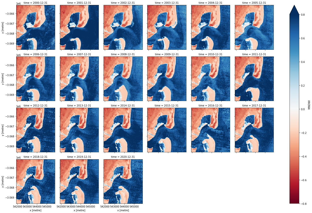
grid_mapping: spatial_refCombine observations into noise-free summary images
Individual remote sensing images can be affected by noisy data, including clouds, sunglint and poor water quality conditions (e.g. sediment). To produce cleaner images that can be compared more easily across time, we can create ‘summary’ images or composites that combine multiple images into one image to reveal the median or ‘typical’ appearance of the landscape for a certain time period. In this case, we use the median as the summary statistic because it prevents strong outliers (like masked cloud values) from skewing the data, which would not be the case if we were to use the mean.
In the code below, we take the time series of images and combine them into single images for each time_step. For example, if time_step = '2Y', the code will produce one new image for each two-year period in the dataset. This step can take several minutes to load if the study area is large.
[12]:
# Combine into summary images by `time_step`
landsat_summaries = (landsat_filtered.MNDWI
                     .compute()
                     .resample(time=time_step, closed='left')
                     .median('time'))

# Shut down Dask client now that we have processed the data we need
client.close()

# Plot the output summary images
landsat_summaries.plot(col='time',
                       cmap='RdBu',
                       col_wrap=6,
                       vmin=-0.8,
                       vmax=0.8)
[12]:
<xarray.plot.facetgrid.FacetGrid at 0x7f5a0f3f0ac0>
Extract shorelines from imagery
We now want to extract an accurate shoreline for each each of the summary images above (e.g. 2000, 2001 etc. summaries). The code below identifies the boundary between land and water by tracing a line along pixels with a water index value of 0 (halfway between land and water water index values). It returns a geopandas.GeoDataFrame with one line feature for each time step:
[13]:
# Extract waterlines
contours_gdf = subpixel_contours(da=landsat_summaries,
                                 z_values=0,
                                 output_path=f'output_waterlines.geojson',
                                 min_vertices=50)

# Plot output shapefile over the first MNDWI layer in the time series
landsat_summaries.isel(time=0).plot(size=12,
                                    cmap='Greys',
                                    add_colorbar=False)
contours_gdf.plot(ax=plt.gca(),
                  column='time',
                  cmap='inferno',
                  linewidth=2,
                  legend=True,
                  legend_kwds={'loc': 'lower right'})
Operating in single z-value, multiple arrays mode
Writing contours to output_waterlines.geojson
[13]:
<Axes: title={'center': 'spatial_ref = 32656, tide_model = FES2014, time...'}, xlabel='x [metre]', ylabel='y [metre]'>
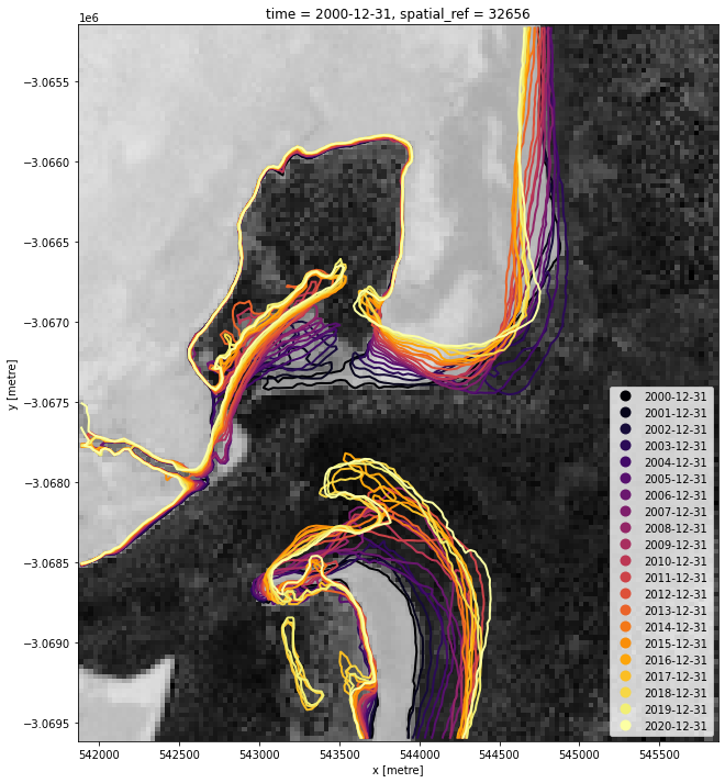
The above plot is a basic visualisation of the contours returned by the subpixel_contours function. Given we now have the shapefile, we can use a more complex function to make an interactive plot for viewing the change in shoreline over time below.
Plot interactive map of output shorelines coloured by time
The next cell provides an interactive map with an overlay of the shorelines identified in the previous cell. Run it to view the map.
Zoom in to the map below to explore the resulting set of shorelines. Older shorelines are coloured in yellow, and more recent shorelines in red. Hover over the lines to see the time period for each shoreline printed above the map. Using this data, we can easily identify areas of coastline or rivers that have changed significantly over time, or areas that have remained stable over the entire time period.
[14]:
# Plot on interactive map
contours_gdf.explore(column='time', cmap='inferno', categorical=True)
[14]:
Drawing conclusions
Here are some questions to think about:
What can you conclude about the change in the shoreline?
Which sections of the shoreline have seen the most change?
Is the change consistent with erosion?
What other information might you need to draw additional conclusions about the cause of the change?
Next steps
When you are done, return to the “Set up analysis” cell, modify some values (e.g. time_range, tide_range, time_step or lat_range/lon_range) and rerun the analysis. For example, to run the same analysis on the Gold Coast/Tweed Head beaches near the NSW/Queensland border, you could try the following values:
lat_range = (-28.16, -28.18)
lon_range = (153.52, 153.56)
time_range = ('1988', '2018')
time_step = '2YE'
tide_range = (0.50, 1.00)
Or to analyse an erosion hotspot at Pinnaroo Point in Perth, WA:
lat_range = (-31.795, -31.835)
lon_range = (115.72, 115.75)
time_range = ('1988', '2018')
time_step = '2YE'
tide_range = (0.50, 1.00)
If you change the location, you’ll need to make sure Landsat 5, 7 and 8 data is available for the new location, which you can check at the DEA Explorer (use the drop-down menu to view all Landsat products).
Digital Earth Australia Coastlines
The Digital Earth Australia Coastlines product is a continental dataset providing annual shorelines and rates of change along the entire Australian coastline from 1988 to the present. To explore this dataset: * Run the DEA Coastlines notebook * Explore the dataset on the interactive DEA Maps platform. * Read the scientific paper:
Bishop-Taylor, R., Nanson, R., Sagar, S., Lymburner, L. (2021). Mapping Australia’s dynamic coastline at mean sea level using three decades of Landsat imagery. Remote Sensing of Environment 267, 112734. Available: https://doi.org/10.1016/j.rse.2021.112734
Additional information
License: The code in this notebook is licensed under the Apache License, Version 2.0. Digital Earth Australia data is licensed under the Creative Commons by Attribution 4.0 license.
Contact: If you need assistance, please post a question on the Open Data Cube Discord chat or on the GIS Stack Exchange using the open-data-cube tag (you can view previously asked questions here). If you would like to report an issue with this notebook, you can file one on
GitHub.
Last modified: July 2025
Compatible datacube version:
[15]:
print(datacube.__version__)
1.8.19
Tags
Tags: NCI compatible, sandbox compatible, landsat 5, landsat 7, landsat 8, landsat 9, load_ard, mostcommon_crs, calculate_indices, tag_tides, subpixel_contours, display_map, rgb, MNDWI, tide modelling, image compositing, waterline extraction, real world, coastal erosion