Detecting change in Australian forestry 
Sign up to the DEA Sandbox to run this notebook interactively from a browser
Compatibility: Notebook currently compatible with both the
NCIandDEA SandboxenvironmentsProducts used: ga_s2am_ard_3, ga_s2bm_ard_3, ga_s2cm_ard_3
Background
Effective management of Australia’s forests is critical for balancing environmental protection and sustainable growth of the industry. Methods for detecting meaningful and significant change in forests are important for those who manage and monitor large areas of forest.
On-the-ground monitoring can be expensive and time-consuming, especially when forests are in difficult-to-navigate terrain. Aerial photography and LiDAR can provide detailed information about forests, but are often extremely expensive to acquire, even over small areas.
Sentinel-2 use case
Satellite imagery from the EU Copernicus Sentinel-2 mission is freely available and has a revisit time over Australia of ~5 days. Its 10 metre resolution makes it perfect for monitoring fine changes over very large areas of land. The archive of Sentinel-2 data stretches back to 2015, meaning that there is a good amount of data for change detection, allowing us to average out or focus on seasonal changes.
Description
In this example, we measure the presence of vegetation from Sentinel-2 imagery and apply a hypothesis test to identify areas of significant change (along with the direction of the change). The worked example takes users through the code required to do the following:
Load cloud-free Sentinel-2 images for an area of interest
Compute an index to highlight presence of vegetation (NDVI)
Apply a statistical hypothesis test to find areas of significant change
Visualise the statistically significant areas.
Getting started
To run this analysis, run all the cells in the notebook, starting with the “Load packages” cell.
After finishing the analysis, return to the “Analysis parameters” cell, modify some values (e.g. choose a different location or time period to analyse) and re-run the analysis. There are additional instructions on modifying the notebook at the end.
Load packages
Load key Python packages and any supporting functions for the analysis.
[1]:
%matplotlib inline

import datacube
import numpy as np
import xarray as xr
import pandas as pd
import matplotlib.pyplot as plt
from scipy import stats
from datacube.utils.cog import write_cog
from datacube.utils.geometry import CRS

import sys
sys.path.insert(1, '../Tools/')
from dea_tools.datahandling import load_ard
from dea_tools.plotting import rgb, display_map
from dea_tools.bandindices import calculate_indices
from dea_tools.dask import create_local_dask_cluster
Set up a Dask cluster
Dask can be used to better manage memory use down and conduct the analysis in parallel. For an introduction to using Dask with Digital Earth Australia, see the Dask notebook. To use Dask, set up the local computing cluster by running the cell below.
[2]:
create_local_dask_cluster()
Client
Client-c463bec5-f4b3-11ef-8486-421e1652a7a6
| Connection method: Cluster object | Cluster type: distributed.LocalCluster |
| Dashboard: /user/robbi.bishoptaylor@ga.gov.au/proxy/8787/status |
Cluster Info
LocalCluster
e60f8aaa
| Dashboard: /user/robbi.bishoptaylor@ga.gov.au/proxy/8787/status | Workers: 1 |
| Total threads: 31 | Total memory: 237.21 GiB |
| Status: running | Using processes: True |
Scheduler Info
Scheduler
Scheduler-311cb8ed-efd2-4b5e-b96c-7d78dadf85d1
| Comm: tcp://127.0.0.1:44397 | Workers: 1 |
| Dashboard: /user/robbi.bishoptaylor@ga.gov.au/proxy/8787/status | Total threads: 31 |
| Started: Just now | Total memory: 237.21 GiB |
Workers
Worker: 0
| Comm: tcp://127.0.0.1:42045 | Total threads: 31 |
| Dashboard: /user/robbi.bishoptaylor@ga.gov.au/proxy/38259/status | Memory: 237.21 GiB |
| Nanny: tcp://127.0.0.1:46155 | |
| Local directory: /tmp/dask-scratch-space/worker-91_wr1t3 | |
Connect to the datacube
Activate the datacube database, which provides functionality for loading and displaying stored Earth observation data.
[3]:
dc = datacube.Datacube(app="Change_detection")
Analysis parameters
The following cell sets the parameters, which define the area of interest and the length of time to conduct the analysis over. There is also a parameter to define how the data is split in time; the split yields two non-overlapping samples, which is a requirement of the hypothesis test we want to run (more detail below). The parameters are:
latitude: The latitude range to analyse (e.g.(-35.316, -35.333)). For reasonable loading times, make sure the range spans less than ~0.1 degrees.longitude: The longitude range to analyse (e.g.(149.267, 149.29)). For reasonable loading times, make sure the range spans less than ~0.1 degrees.time: The date range to analyse (e.g.('2017-06-01', '2018-06-01')). Note that Sentinel-2 data is only available after 2015.time_baseline: The date at which to split the total sample into two non-overlapping samples (e.g.'2018-01-01'). For reasonable results, pick a date that is about halfway between the start and end dates specified intime.
If running the notebook for the first time, keep the default settings below. This will demonstrate how the analysis works and provide meaningful results. The example covers the Kowen Forest, a commercial pine plantation in the Australian Capital Territory. To run the notebook for a different area, make sure Sentinel-2 data is available for the chosen area using the DEA Explorer.
[4]:
# Define the area of interest
latitude = (-35.316, -35.333)
longitude = (149.267, 149.29)

# Set the range of dates for the complete sample
time = ('2017-06-01', '2018-06-01')

# Set the date to separate the data into two samples for comparison
time_baseline = '2018-01-01'
View the selected location
The next cell will display the selected area on an interactive map. The red border represents the area of interest of the study. Zoom in and out to get a better understanding of the area of interest. Clicking anywhere on the map will reveal the latitude and longitude coordinates of the clicked point.
[5]:
display_map(x=longitude, y=latitude)
[5]:
Load and view Sentinel-2 data
The first step in the analysis is to load Sentinel-2 data for the specified area of interest and time range. This uses the pre-defined load_ard utility function. This function will automatically mask any clouds in the dataset, and use the cloud_cover satellite data metadata field to return only images with less than 10% cloud cover.
Note: The data may take a few minutes to load. Click the Dask dashboard link (“Dashboard: …”) under the Set up a Dask cluster cell above to monitor progress. The load is complete when the cell status below goes from [*] to [number].
[6]:
# Choose products to load
# Here, all Sentinel-2 products are chosen
products = ["ga_s2am_ard_3", "ga_s2bm_ard_3", "ga_s2cm_ard_3"]

# Specify the parameters to pass to the load query
query = {
    "x": longitude,
    "y": latitude,
    "time": time,
    "cloud_cover": (0, 10),  # load only non-cloudy images (< 10% cloud)
    "measurements": [
        "nbart_red",  # Red band
        "nbart_green",  # Green band
        "nbart_blue",  # Blue band
        "nbart_nir_1",  # Near-infrared band
    ],
    "output_crs": "EPSG:3577",
    "resolution": (-20, 20),
    "dask_chunks": {"x": 2048, "y": 2048},
}

# Lazily load the data
ds_s2 = load_ard(
    dc,
    products=products,
    cloud_mask="s2cloudless",  # mask out clouds using the "s2cloudless" mask
    **query
)

# Load into memory using Dask
ds_s2.load()
Finding datasets
    ga_s2am_ard_3
    ga_s2bm_ard_3
    ga_s2cm_ard_3
Applying s2cloudless pixel quality/cloud mask
Returning 34 time steps as a dask array
/env/lib/python3.10/site-packages/rasterio/warp.py:387: NotGeoreferencedWarning: Dataset has no geotransform, gcps, or rpcs. The identity matrix will be returned.
  dest = _reproject(
[6]:
<xarray.Dataset> Size: 7MB
Dimensions:      (time: 34, y: 108, x: 117)
Coordinates:
  * time         (time) datetime64[ns] 272B 2017-06-14T00:06:29.461000 ... 20...
  * y            (y) float64 864B -3.963e+06 -3.963e+06 ... -3.965e+06
  * x            (x) float64 936B 1.562e+06 1.562e+06 ... 1.564e+06 1.564e+06
    spatial_ref  int32 4B 3577
Data variables:
    nbart_red    (time, y, x) float32 2MB 207.0 197.0 ... 1.178e+03 1.224e+03
    nbart_green  (time, y, x) float32 2MB 319.0 234.0 248.0 ... 862.0 896.0
    nbart_blue   (time, y, x) float32 2MB 193.0 237.0 215.0 ... 703.0 764.0
    nbart_nir_1  (time, y, x) float32 2MB 1.773e+03 1.706e+03 ... 1.686e+03
Attributes:
    crs:           EPSG:3577
grid_mapping: spatial_refOnce the load is complete, examine the data by printing it in the next cell. The Dimensions argument revels the number of time steps in the data set, as well as the number of pixels in the x (longitude) and y (latitude) dimensions.
[7]:
ds_s2
[7]:
<xarray.Dataset> Size: 7MB
Dimensions:      (time: 34, y: 108, x: 117)
Coordinates:
  * time         (time) datetime64[ns] 272B 2017-06-14T00:06:29.461000 ... 20...
  * y            (y) float64 864B -3.963e+06 -3.963e+06 ... -3.965e+06
  * x            (x) float64 936B 1.562e+06 1.562e+06 ... 1.564e+06 1.564e+06
    spatial_ref  int32 4B 3577
Data variables:
    nbart_red    (time, y, x) float32 2MB 207.0 197.0 ... 1.178e+03 1.224e+03
    nbart_green  (time, y, x) float32 2MB 319.0 234.0 248.0 ... 862.0 896.0
    nbart_blue   (time, y, x) float32 2MB 193.0 237.0 215.0 ... 703.0 764.0
    nbart_nir_1  (time, y, x) float32 2MB 1.773e+03 1.706e+03 ... 1.686e+03
Attributes:
    crs:           EPSG:3577
grid_mapping: spatial_refPlot example timestep in true colour
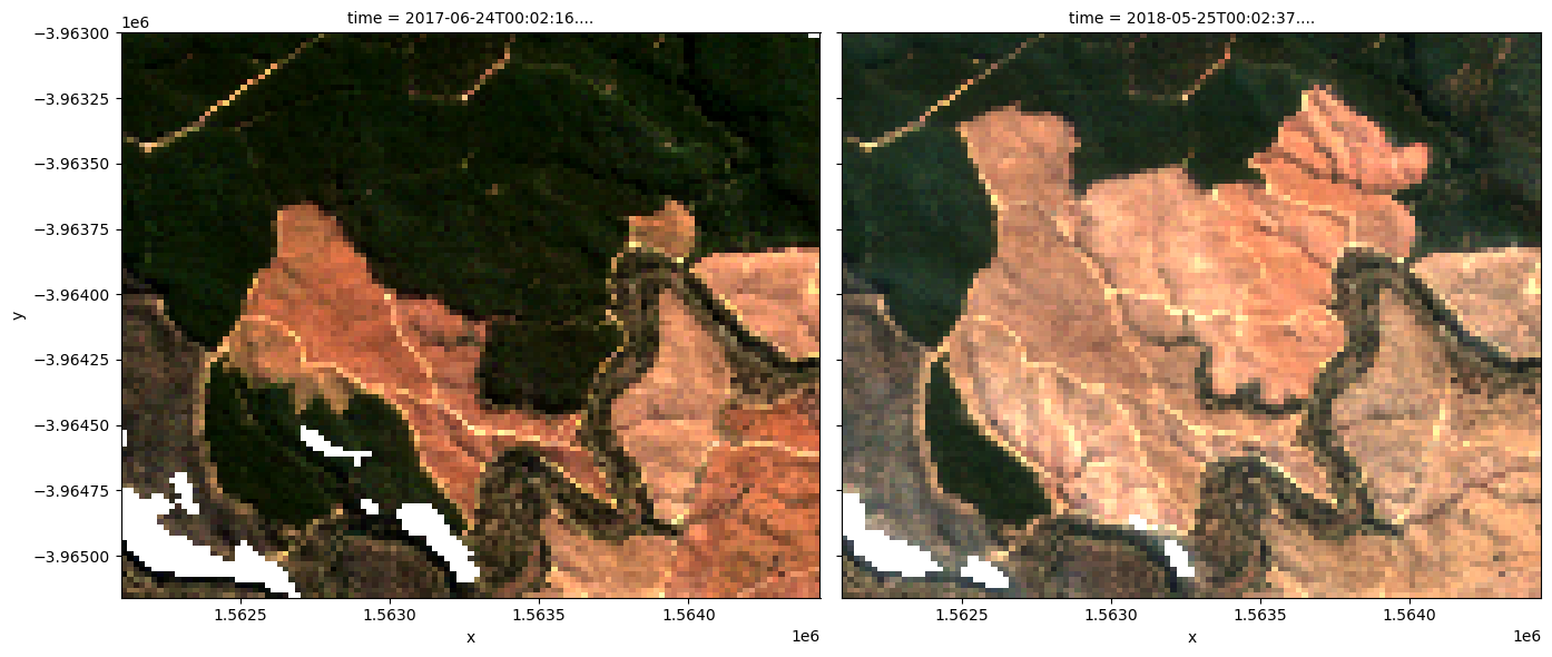
To visualise the data, use the rgb utility function to plot a true colour image for a given time-step. White spots in the images are where clouds have been masked out.
The settings below will display images for two time steps, one in mid 2017, one in mid 2018. Can you spot any areas of change?
Feel free to experiement with the values for the initial_timestep and final_timestep variables; re-run the cell to plot the images for the new timesteps. The values for the timesteps can be 0 to one fewer than the number of time steps loaded in the data set. The number of time steps is the same as the total number of observations listed as the output of the cell used to load the data.
Note: If the location and time are changed, you may need to change the
intial_timestepandfinal_timestepparameters to view images at similar times of year.
[8]:
# Set the timesteps to visualise
initial_timestep = 1
final_timestep = -1

# Generate RGB plots at each timestep
rgb(ds_s2, index=[initial_timestep, final_timestep])
Compute band indices
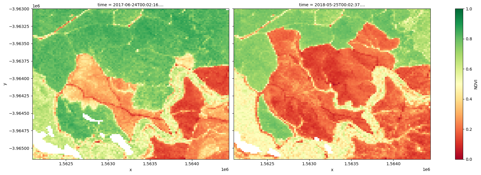
This study measures vegetation through the normalised difference vegetation index (NDVI), which can be calculated using the predefined calculate_indices utility function. This index uses the ratio of the red and near-infrared (NIR) bands to identify live green vegetation. The formula is
When interpreting this index, high values indicate vegetation, and low values indicate soil or water.
[9]:
# Calculate NDVI and add it to the loaded dataset
ds_s2 = calculate_indices(ds_s2, 'NDVI', collection='ga_s2_3')
The plots below show the NDVI values for the two selected timesteps used to make the true-colour images above. Use the plots to visually confirm whether NDVI is a suitable index for change detection.
[10]:
# Plot the NDVI values for pixels classified as water for the two dates.
ds_s2.NDVI.isel(time=[initial_timestep, final_timestep]).plot.imshow(
    col="time", cmap="RdYlGn", vmin=0, vmax=1, figsize=(18, 6)
)

plt.show()
Perform hypothesis test
While it is possible to visually detect change between the 2016-01-01 and 2018-12-26 timesteps, it is important to consider how to rigorously check for both positive change in the NDVI (afforestation) and negative change in the NDVI (deforestation).
This can be done through hypothesis testing. In this case,
The hypothesis test will indicate where there is evidence for rejecting the null hypothesis. From this, we may identify areas of signficant change, according to a given significance level (covered in more detail below).
Make samples
To perform the test, the total sample will be split in two: a baseline sample and a postbaseline sample, which respectively contain the data before and after the time_baseline date. Then, we can test for a difference in the average NDVI between the samples for each pixel in the sample.
The samples are made by selecting the NDVI band from the dataset and filtering it based on whether it was observed before or after the time_baseline date. The number of observations in each sample will be printed. If one sample is much larger than the other, consider changing the time_baseline parameter in the “Analysis parameters” cell, and then re-run this cell. Coordinates are recorded for later use.
[11]:
# Make samples
baseline_sample = ds_s2.NDVI.sel(time=ds_s2["time"] <= np.datetime64(time_baseline))
print(f"Number of observations in baseline sample: {len(baseline_sample.time)}")

postbaseline_sample = ds_s2.NDVI.sel(time=ds_s2["time"] > np.datetime64(time_baseline))
print(f"Number of observations in postbaseline sample: {len(postbaseline_sample.time)}")
Number of observations in baseline sample: 18
Number of observations in postbaseline sample: 16
Test for change
To look for evidence that the average NDVI has changed between the two samples (either positively or negatively), we use Welch’s t-test. This is used to test the hypothesis that two populations have equal averages. In this case, the populations are the area of interest before and after the time_baseline date, and the average being tested is the average NDVI. Welch’s t-test is used (as opposed to Student’s t-test) because the two samples in the study may not necessarily have equal
variances.
The test is run using the Scipy package’s statistcs library, which provides the ttest_ind function for running t-tests. Setting equal_var=False means that the function will run Welch’s t-test. The function returns the t-statistic and p-value for each pixel after testing the difference in the average NDVI. These are stored as t_stat and p_val inside the t_test dataset for use in the next section.
[12]:
# Perform the t-test on the postbaseline and baseline samples
tstat, p_tstat = stats.ttest_ind(
    postbaseline_sample.values,
    baseline_sample.values,
    equal_var=False,
    nan_policy="omit",
)

t_test = xr.Dataset(
    {"t_stat": (["y", "x"], tstat), "p_val": (["y", "x"], p_tstat)},
    coords={"x": ds_s2.x, "y": ds_s2.y},
    attrs={
        "crs": "EPSG:3577",
    },
)

t_test
[12]:
<xarray.Dataset> Size: 204kB
Dimensions:      (y: 108, x: 117)
Coordinates:
  * x            (x) float64 936B 1.562e+06 1.562e+06 ... 1.564e+06 1.564e+06
    spatial_ref  int32 4B 3577
  * y            (y) float64 864B -3.963e+06 -3.963e+06 ... -3.965e+06
Data variables:
    t_stat       (y, x) float64 101kB -0.04324 0.4078 0.2775 ... 0.2507 1.51
    p_val        (y, x) float64 101kB 0.9659 0.687 0.7837 ... 0.8038 0.1429
Attributes:
crs: EPSG:3577Visualise change
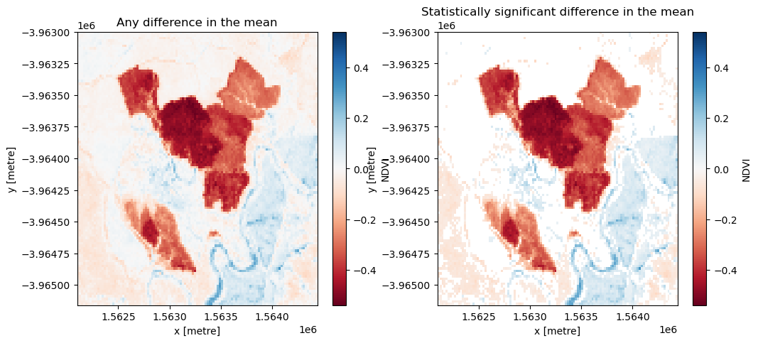
From the test, we’re interested in two conditions: whether the change is significant (rejection of the null hypothesis) and whether the change was positive (afforestation) or negative (deforestation).
The null hypothesis can be rejected if the \(p\)-value (p_val) is less than the chosen significance level, which is set as sig_level = 0.05 for this analysis. If the null hypothesis is rejected, the pixel will be classified as having undergone significant change.
The direction of the change can be inferred from the difference in the average NDVI of each sample, which is calculated as
This means that:
if the average NDVI for a given pixel is higher in the
post baselinesample compared to thebaselinesample, thendiff_meanfor that pixel will be positive.if the average NDVI for a given pixel is lower in the
post baselinesample compared to thebaselinesample, thendiff_meanfor that pixel will be negative.
Run the cell below to first plot the difference in the mean between the two samples, then plot only the differences that were marked as signficant. Positive change is shown in blue and negative change is shown in red.
[13]:
# Set the significance level
sig_level = 0.05

# Plot any difference in the mean
diff_mean = postbaseline_sample.mean(dim=["time"]) - baseline_sample.mean(dim=["time"])
fig, axes = plt.subplots(1, 2, figsize=(12, 5))
diff_mean.plot(ax=axes[0], cmap="RdBu")
axes[0].set_title("Any difference in the mean")

# Plot any difference in the mean classified as significant
sig_diff_mean = postbaseline_sample.mean(dim=["time"]).where(
    t_test.p_val < sig_level
) - baseline_sample.mean(dim=["time"]).where(t_test.p_val < sig_level)
sig_diff_mean.plot(ax=axes[1], cmap="RdBu")
axes[1].set_title("Statistically significant difference in the mean")
plt.show()
Drawing conclusions
Here are some questions to think about:
What has happened in the forest over the time covered by the dataset?
Were there any statistically significant changes that the test found that you didn’t see in the true-colour images?
What kind of activities/events might explain the significant changes?
What kind of activities/events might explain non-significant changes?
What other information might you need to draw conclusions about the cause of the statistically significant changes?
Export the data
To explore the data further in a desktop GIS program, the data can be output as a GeoTIFF. The diff_mean product will be saved as “ttest_diff_mean.tif”, and the sig_diff_mean product will be saved as “ttest_sig_diff_mean.tif”. These files can be downloaded from the file explorer to the left of this window (see these instructions).
[14]:
diff_mean.odc.write_cog(fname="ttest_diff_mean.tif", overwrite=True)
sig_diff_mean.odc.write_cog(fname="ttest_sig_diff_mean.tif", overwrite=True)
[14]:
PosixPath('ttest_sig_diff_mean.tif')
Next steps
When you are done, return to the “Analysis parameters” section, modify some values (e.g. latitude, longitude, time or time_baseline) and re-run the analysis. You can use the interactive map in the “View the selected location” section to find new central latitude and longitude values by panning and zooming, and then clicking on the area you wish to extract location values for. You can also use Google maps to search for a location you know, then return the latitude and longitude
values by clicking the map.
If you’re going to change the location, you’ll need to make sure Sentinel-2 data is available for the new location, which you can check at the DEA Explorer. Use the drop-down menu to check that data from either Sentinel-2A (ga_s2am_ard_3), Sentinel-2B (ga_s2bm_ard_3), or Sentinel-2C (ga_s2cm_ard_3) is available.
Additional information
License: The code in this notebook is licensed under the Apache License, Version 2.0. Digital Earth Australia data is licensed under the Creative Commons by Attribution 4.0 license.
Contact: If you need assistance, please post a question on the Open Data Cube Discord chat or on the GIS Stack Exchange using the open-data-cube tag (you can view previously asked questions here). If you would like to report an issue with this notebook, you can file one on
GitHub.
Last modified: February 2025
Compatible datacube version:
[15]:
print(datacube.__version__)
1.8.19
Tags
Tags: sandbox compatible, NCI compatible, sentinel 2, calculate_indices, display_map, load_ard, rgb, NDVI, real world, forestry, change detection, statistics, GeoTIFF, exporting data